Design System Modernization at Scale:
Figma Migration, WCAG Accessibility, and Cross-Product Consistency Across Boston.com and The Boston Globe
Where It All Begin
Boston Globe Media operated three digital products – The Boston Globe, Boston.com, and Boston Magazine – with a design system that existed on paper but had drifted significantly from what was actually being shipped. When the organization transitioned from Sketch to Figma, I led a comprehensive audit and modernization initiative that went far beyond migration. The result was a unified, accessible, token-based design system – including the organization's first dark mode framework – adopted across design, engineering, product, and editorial through a structured, cross-functional rollout.
The Challenge
When Boston Globe Media began its transition from Sketch to Figma, the organization faced a decision that most teams get wrong: treat migration as a copy-paste exercise, or use it as an opportunity to fix what was actually broken.
I chose the latter.
Over time, a gap had formed between the documented design system and the experiences being shipped across The Boston Globe, Boston.com, and Boston Magazine. Teams had accumulated years of "special case" patterns – one-off solutions that lived in production but never made it back into the system. The result was a fragmented ecosystem where designers were making inconsistent decisions, engineers were implementing variations without a documented rationale, and there was no reliable single source of truth reflecting what was actually live.
The team was small – four designers supporting three products and multiple engineering teams – which meant inconsistency compounded quickly. Without a shared foundation, every new feature created the potential for new drift. Accessibility had no formal baseline. Dark mode had never been designed or defined. And the design-to-engineering handoff relied on tribal knowledge rather than documented standards, creating friction and back-and-forth that slowed delivery on both sides.
The Figma migration was the catalyst. But the real challenge was larger: build a design system that the organization would actually use, actually trust, and actually maintain – one that reflected how the products looked in production, established accessibility as a non-negotiable standard, and gave engineers what they needed to implement correctly without constant design intervention.
The Role and Approach
I led this initiative as the primary driver across all phases – from audit and definition through documentation, engineering enablement, and organizational adoption. I identified the opportunity, made the case for a modernization approach rather than a simple migration, and drove execution while keeping four engineering teams and cross-functional stakeholders aligned throughout.
My approach had four phases:
1. Audit & Gap Analysis
I evaluated production experiences across all three products against the existing Sketch-based system, cataloging inconsistencies, undocumented patterns, and accessibility failures. This gave the modernization work a factual foundation rather than assumptions.
2. System Rebuild & Standards Definition
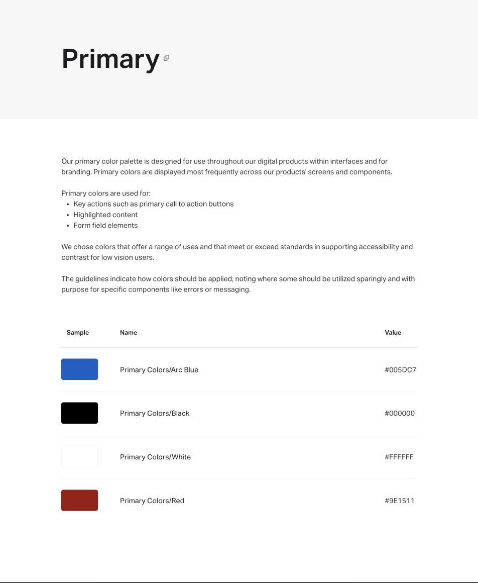
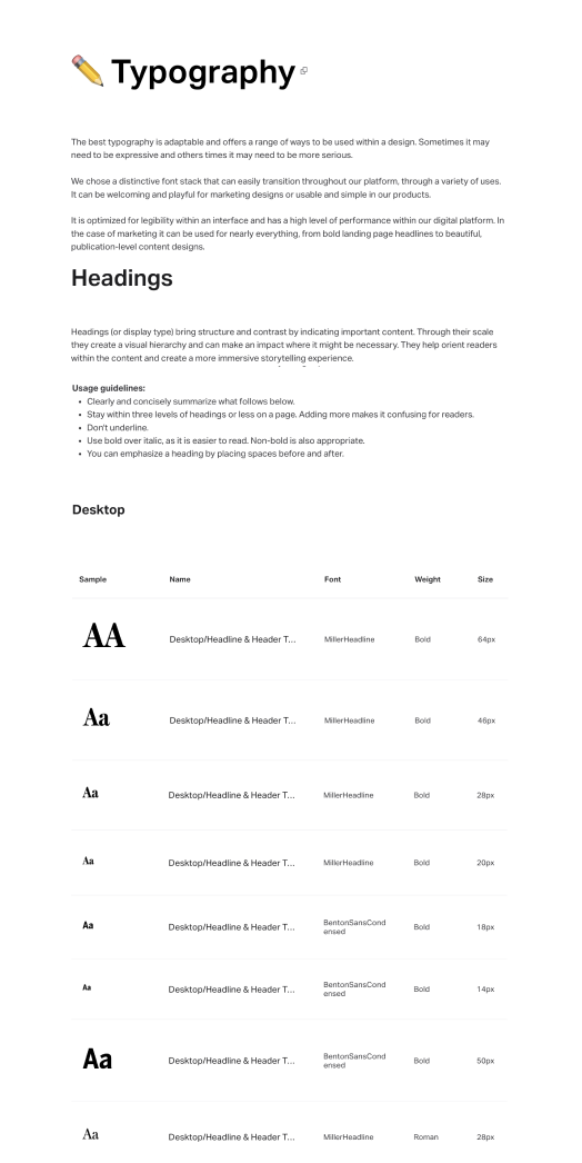
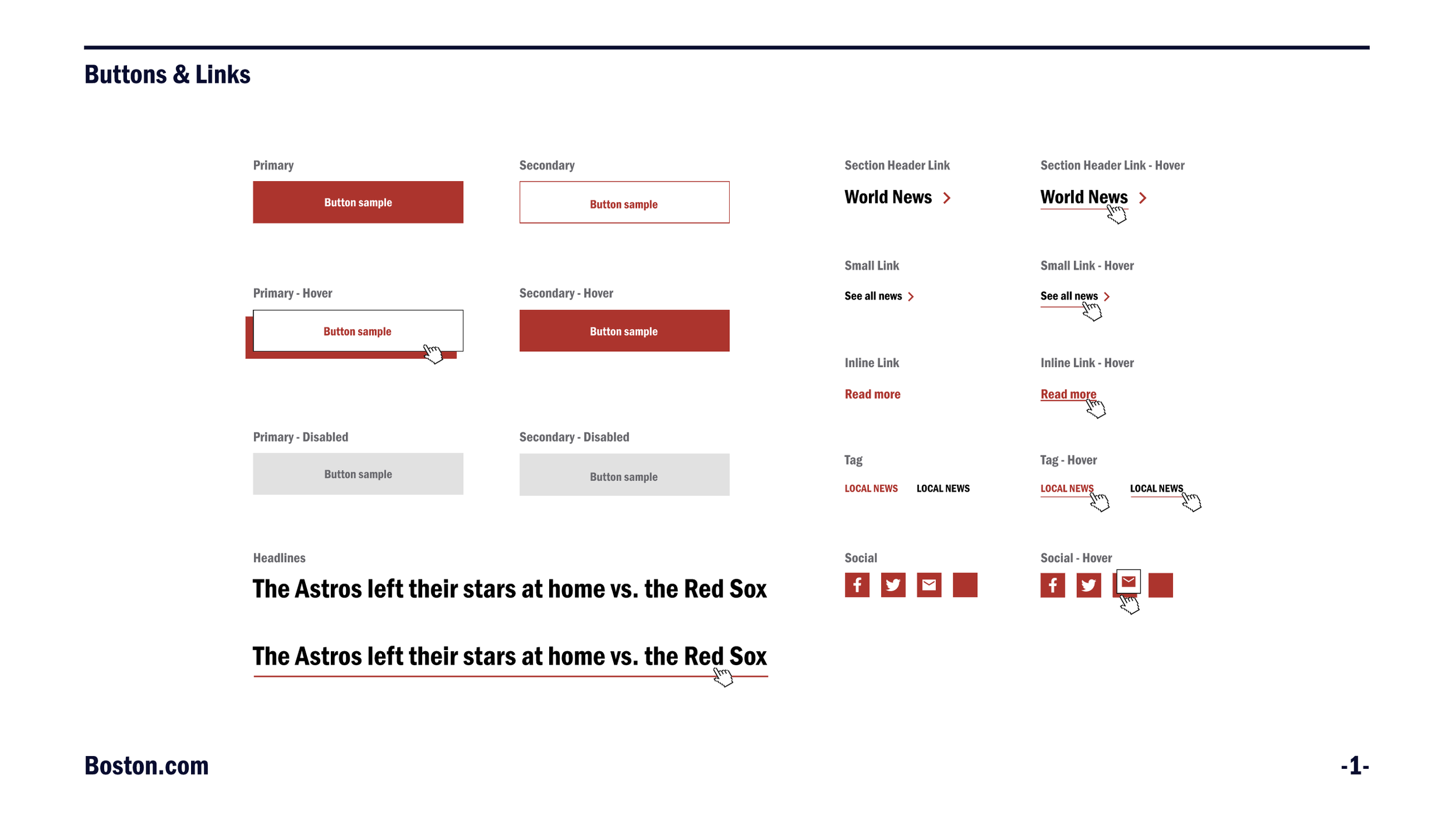
Rather than migrating broken patterns into Figma, I used audit findings to establish scalable, documented standards – typography, spacing, color tokens, component sizing, interaction patterns, and responsive behaviors – grounded in what was actually being shipped and what best practice required.
3. Dark Mode & Accessibility
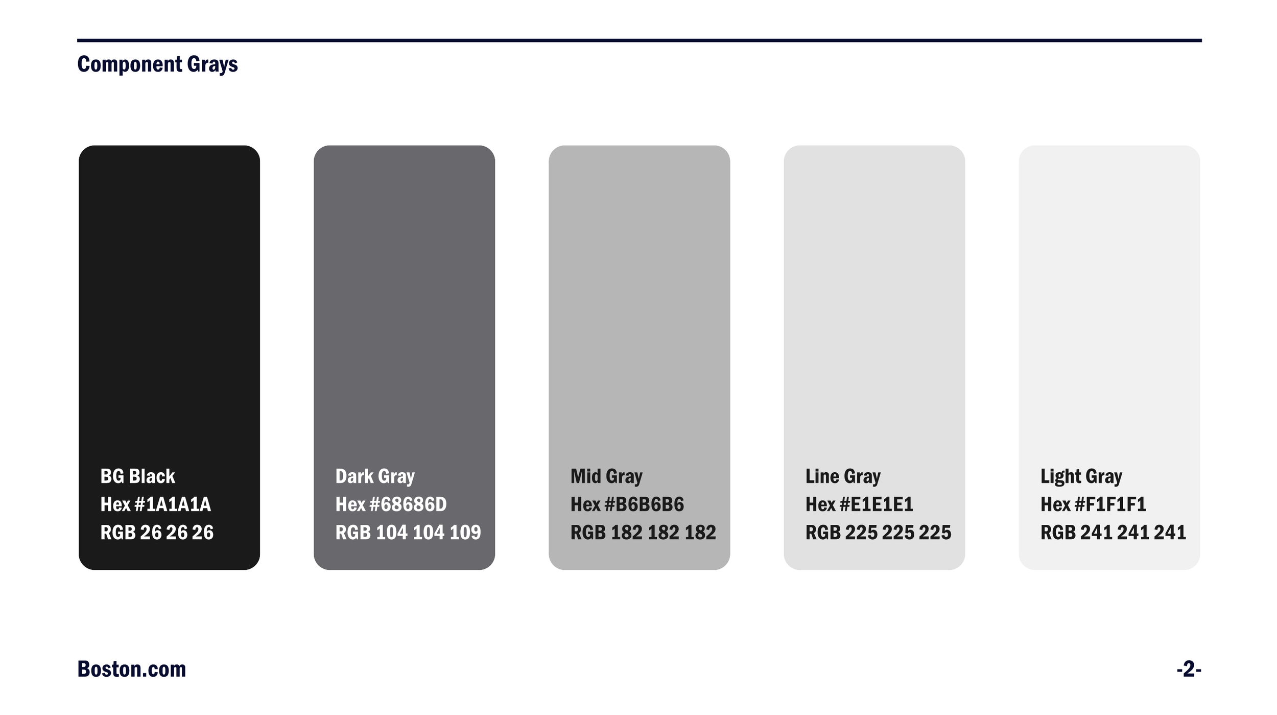
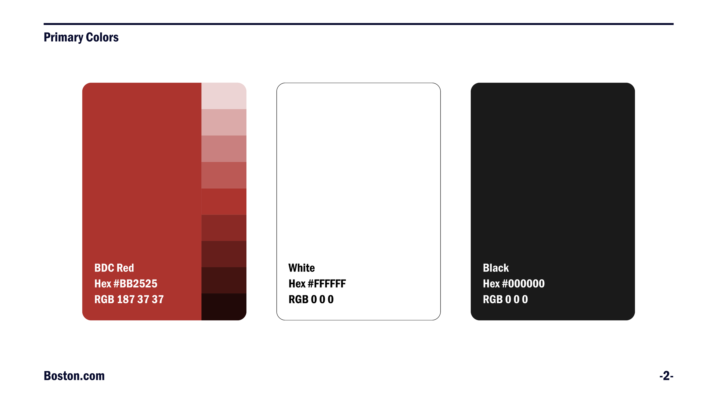
I led the creation of the organization's first dark mode framework, defining color specifications across light and dark themes using Figma Variables – ensuring the system could switch themes at the token level rather than maintaining duplicate files. Accessibility was embedded as a system requirement with WCAG 2.1 AA as the non-negotiable baseline across all color, contrast, typography, and interaction decisions.
4. Engineering Enablement & Adoption
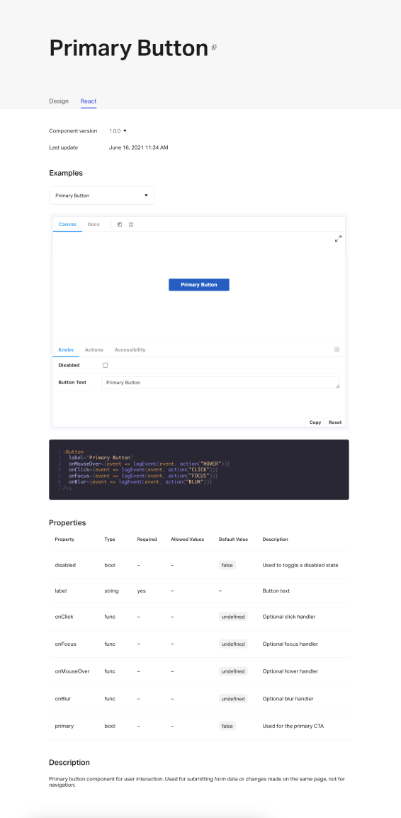
I built the system to be usable without constant design interpretation. Using Figma Dev Mode, components shipped with grab-and-go code specifications, accessibility annotations defining ARIA roles and focus behavior, and documented rationale explaining why decisions were made – eliminating the ambiguity that had caused fragmentation in the first place.
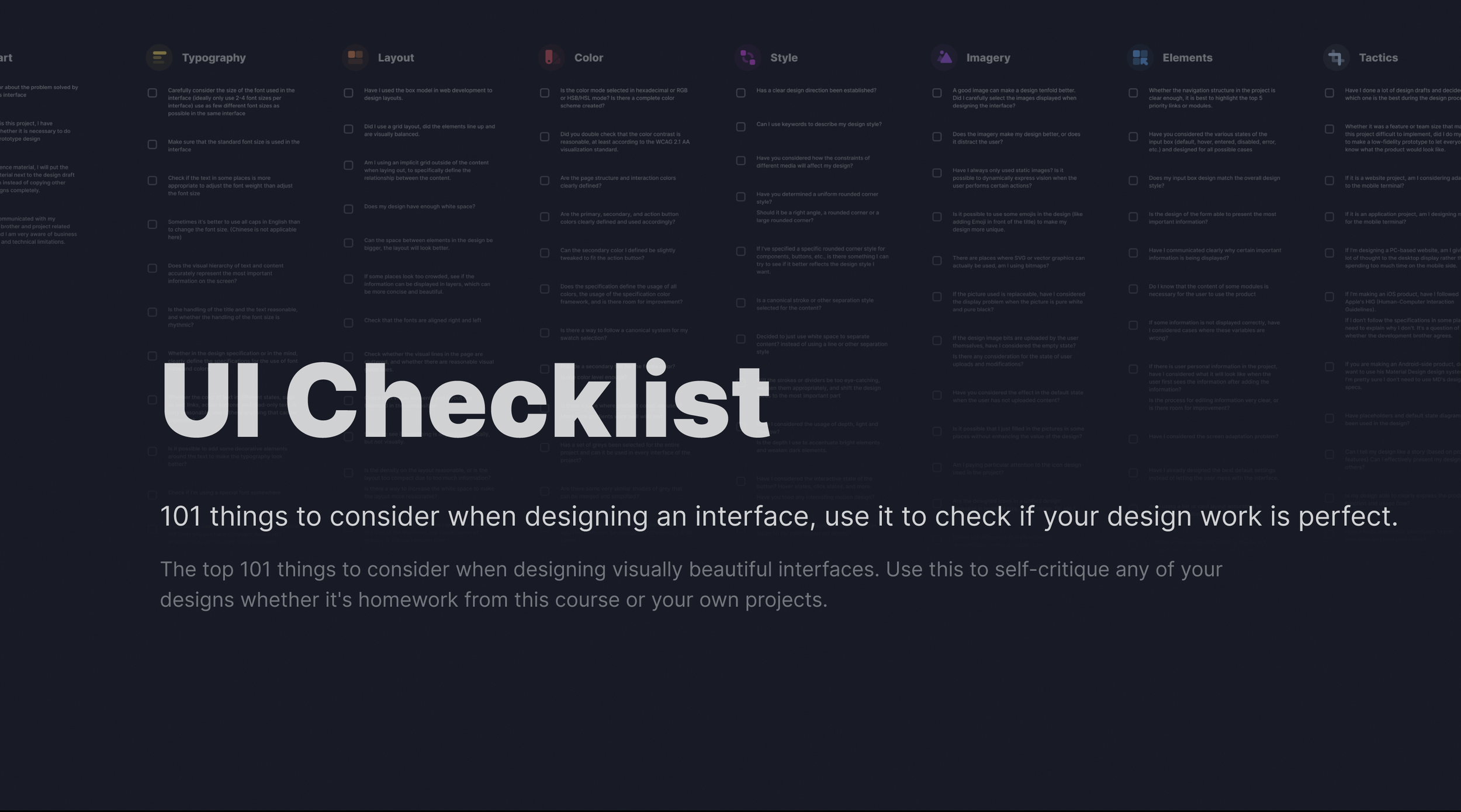
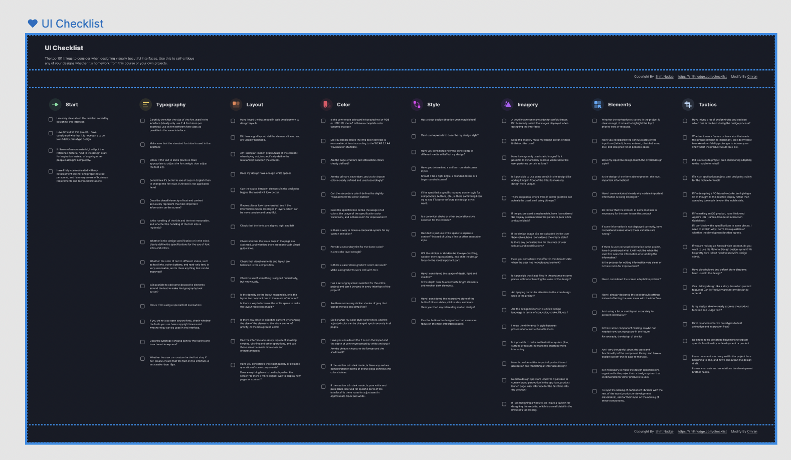
To support consistent design quality across the team, I developed a companion UI Design Checklist – a structured quality gate used by designers before moving from high-fidelity to interactive prototype.
The checklist covered: problem clarity, visual hierarchy, typographic decision-making, grid and spacing integrity, color contrast compliance against WCAG 2.1 AA, primary and secondary button color definitions, white space evaluation, and gradient usage standards.
This artifact served two purposes: it reinforced system standards at the moment of design decision-making, and it reduced revision cycles by catching common errors before handoff. Combined with the modernized design system, it created a shared quality standard across a four-person team working simultaneously across three products.
The UI Checklist – A Process Artifact
Emerging Tools & AI Workflow Integration


Modernizing the system also meant modernizing how the team worked. A design system is only as strong as the workflows built around it – and a four-person team supporting three products cannot afford to spend time on manual overhead that tooling can eliminate.
I introduced three tools with specific, intentional purposes:
Figma Variables
Became the backbone of the dark mode framework. Rather than maintaining separate files or duplicating color decisions across themes, I structured the entire color system using Variables – mapping primitive tokens to semantic tokens that could switch between light and dark mode at the component level. This meant dark mode was not a separate design file or a one-off override. It was a system behavior, scalable across every component and every surface from a single source of truth.
Figma Dev Mode
Closed the handoff gap that had been generating engineering back-and-forth. Components in Dev Mode shipped with ready-to-use code specifications, accessibility annotations, and documented states – giving developers what they needed to implement correctly without requiring a design sync for every standard pattern. This was the infrastructure behind the grab-and-go workflow I built for engineering teams.
UX Pilot
Introduced AI-assisted design generation into the team's workflow, accelerating early-stage exploration and reducing the time spent on low-level production tasks. This freed design bandwidth for higher-order decisions – system architecture, accessibility evaluation, and cross-functional alignment – rather than manual execution.
Together, these tools were not adopted for novelty. They were selected to solve three specific problems: system scalability, engineering enablement, and design team velocity.
Rollout & Organizational Adoption
A design system only has value if it gets used. I treated adoption as a design problem in itself – one that required the same intentionality as the system.
Design team
I led working sessions, walking through the rationale behind key decisions, not just the decisions themselves. Understanding the why was essential to preventing the pattern drift that had caused the original fragmentation.
Product organization
I presented the updated system and accessibility standards to Product Managers, Engineers, Editorial stakeholders, and Directors – covering design principles, implementation expectations, and the business rationale for the investment.
Engineering
I facilitated dedicated sessions with developer teams focused on component specifications, implementation guidance, accessibility requirements, and how to use the Dev Mode code resources directly in their workflows – removing the dependency on design interpretation for standard patterns.
Company-wide
I presented accessibility best practices and the case for inclusive design at a company-wide hackathon – expanding accessibility awareness beyond the product organization and positioning it as an organizational value, not just a design team concern.
User-facing
Dark mode launched as an optional user preference across web, mobile, and app surfaces across all three products. I also designed a dark mode onboarding experience within the app – introducing the feature to new and existing users and guiding them to where it was located in their settings.
Impact
The modernized design system became the single source of truth across The Boston Globe, Boston.com, and Boston Magazine — replacing years of accumulated fragmentation with documented, rationale-backed standards that design and engineering could rely on equally.
System scale
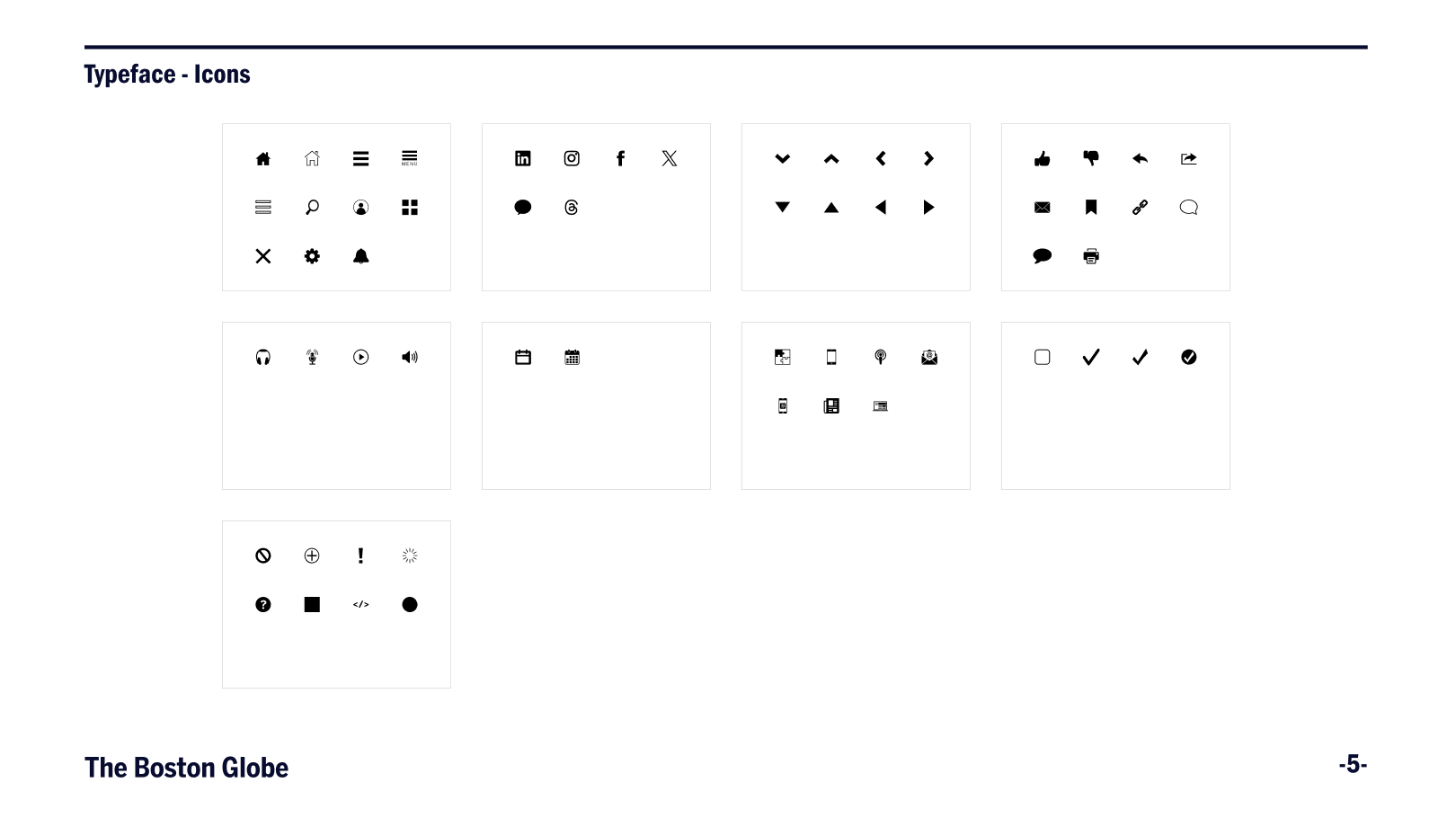
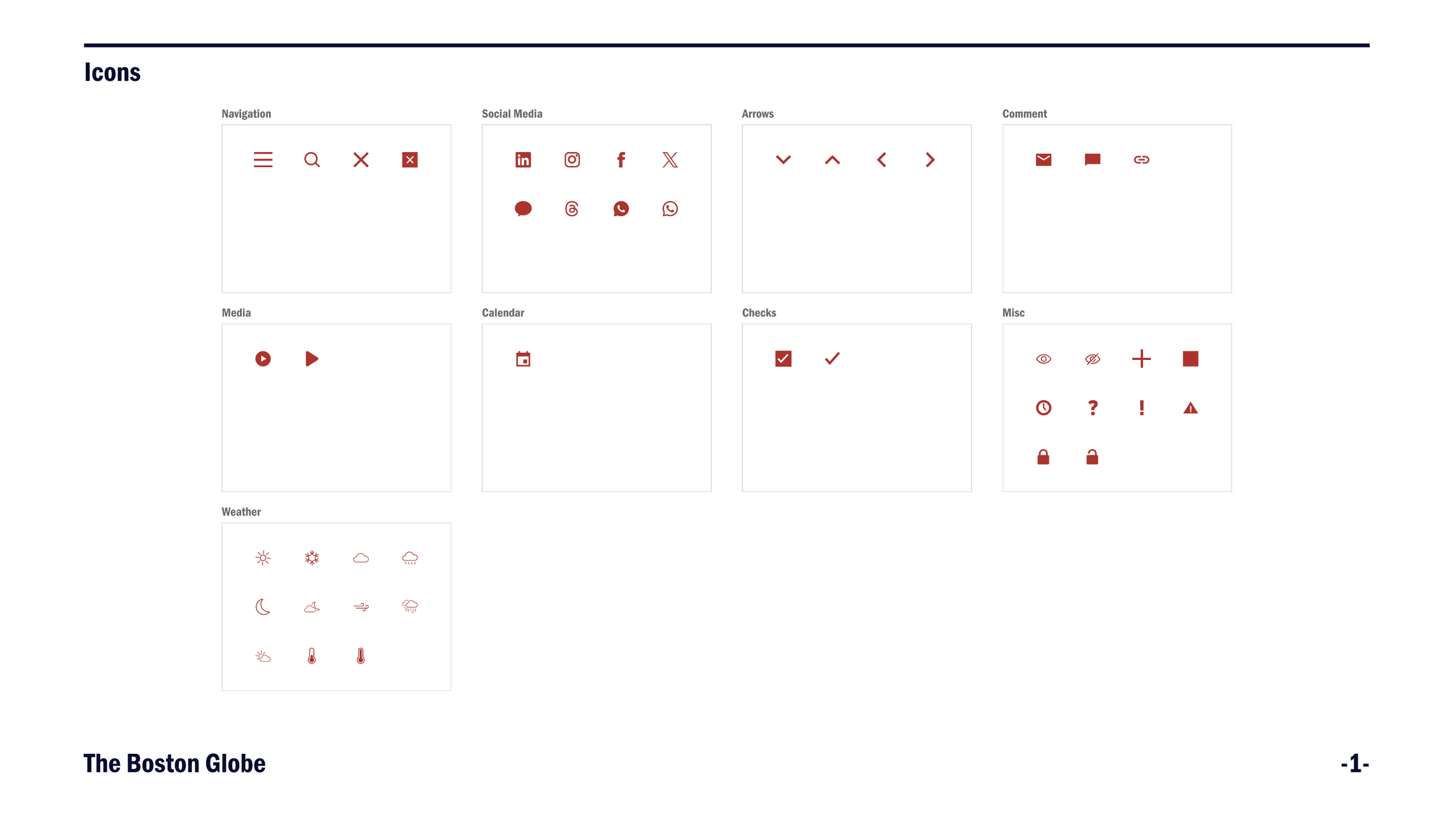
Delivered a component library of 20–40+ standardized components spanning buttons, form elements, navigation, typography, color tokens, icons, alerts, and pagination — each documented with usage rationale, interaction states, accessibility annotations, and dark mode variants across light and dark themes
Eliminated special-case pattern proliferation
documented rationale gave teams a defensible reference point, preventing one-off decisions from re-entering the system and ending the cycle of undocumented "what's live" discrepancies.
Reduced design-to-engineering back-and-forth
Figma Dev Mode code specifications, accessibility annotations, and component documentation removed implementation ambiguity at handoff, giving engineering teams a grab-and-go workflow that no longer required design interpretation for standard patterns.
Established the organization's first accessibility baseline
A WCAG 2.1 AA audit surfaced a significant number of failures concentrated primarily across The Boston Globe, spanning color contrast, focus states, and component-level non-compliance. All identified failures were remediated within the system before rollout, and accessibility is now embedded at the component level.
Launched the organization's first dark mode
shipped across all three products on web, mobile, and app within a three-month window, powered by a Figma Variables token architecture that made theme switching a system behavior rather than a manual override.
Designed and shipped a user-facing dark mode onboarding experience
Introducing the feature to users at first app launch and directing them to their preference settings, driving awareness and voluntary adoption.
Increased design team velocity
The companion UI Design Checklist reduced revision cycles by catching quality and consistency issues beforehand, creating a shared quality standard across a four-person team working simultaneously across three products.
Expanded accessibility literacy organization-wide
Through design team working sessions, cross-functional presentations to PMs, engineers, editorial, and directors, and a company-wide hackathon talk reaching approximately 50–60 attendees across product, editorial, business, and operations — one of the few design initiatives to reach beyond the product organization entirely.
Delivered within three months
The full audit, rebuild, documentation, dark mode framework, and cross-functional rollout were completed while the team continued shipping active product work in parallel.
What I Would Do Differently
With a team of four designers and no dedicated systems role, long-term maintenance governance was a gap I did not fully address. The system was strong at launch, but sustaining it required contributions from designers who were simultaneously shipping product work. If I were doing this again, I would establish a formal contribution model and review cadence from the start – making system maintenance a shared, structured responsibility with clear ownership rather than something that defaulted back to me as the system's originator.