Reimagining the Subscription Journey
Across Boston.com & The Boston Globe
✨
Role: Product Designer
Duration: Product Designer
Tools: Figma, Maze, SurveyMonkey, Zoom, Claude.ai
Boston.com attracts millions of readers every month, but it was losing them at the exact moment they chose to pay.
When a user hit a paywall and clicked "Subscribe," they were silently handed off to The Boston Globe: a different product, different UI, different brand. No warning. No continuity. Just a jarring context switch at the highest-intent moment in the funnel and a measurable drop-off as a result.
The problem wasn't a broken page or a poorly designed button. It was structural. Two teams owned adjacent parts of the same journey with no shared accountability for the seam between them. Fixing it required more than a checkout redesign; it required reframing the entire subscription experience as a connected system across two products.
I led the design of that system. From the first paywall prompt to post-subscription onboarding, I connected acquisition, conversion, and retention into a unified experience, one that preserved Boston.com's brand identity, rebuilt trust at the moment of commitment, and gave newly converted subscribers a reason to return. The experience shipped, with an experimentation framework in place to validate and iterate on its performance.
1.Opportunity & Problem Framing

A. How I Identified the Opportunity
The problem didn't announce itself. It emerged from three converging signals that, together, made the case impossible to ignore.
1
Analytics pointed to a fragile moment.
Checkout was already the highest-intent point in the funnel. Users had engaged with content, hit the paywall, and chosen to subscribe. But it was also where the experience was most fragile. Funnel data showed that friction at this stage - unclear pricing, unexpected redirects, account-creation barriers, which were causing a measurable drop-off at the exact moment users were closest to converting. Even marginal improvements to clarity and continuity at this step had an outsized potential impact on overall subscription acquisition.
1
Through conversations with leaders across Product, Subscription, Marketing, and Editorial, a consistent picture emerged. Boston.com was attracting 3–6 million monthly unique visitors — a significant top-of-funnel asset — but had no cohesive path to convert that audience into subscribers. Stakeholders flagged four compounding pressures: declining advertising revenue, which created urgency around subscription growth; a need to better communicate the Globe bundle's value; limited touchpoints to engage readers before asking them to pay; and a fragmented handoff between Boston.com and The Boston Globe that undermined trust at the conversion moment.
2.Research & Insight
To understand where and why the subscription experience was breaking down, I used two primary research methods: interviews and surveys with 10–15 Boston.com users who had encountered the subscription flow, and competitive benchmarking of 11 subscription products across news, streaming, and media.
A. Benchmarking
I led a structured competitive review across 11 products:
Financial Times
Disney/Hulu/ESPN/Max
MassLive
Netflix
Atlanta Journal-Constitution
Minnesota Star Tribune
New York Times,
Philadelphia Inquirer,
CNN's new metered paywall,
The Verge
Spotify.
These patterns directly shaped my design decisions:
B. What Users Told Us
Four core friction points surfaced consistently across interviews and surveys:
The account creation page looked like a standard sign-in screen. Users assumed they already needed an account to proceed, causing hesitation and confusion at the first step of checkout.
Pricing and billing terms weren't visible enough. Users wanted to clearly understand what they'd be charged after the trial period, and that information was either buried or absent. As one participant put it: "I wanted the terms and details of how I would be charged in the future to be made much more prevalent and clear."
The value proposition wasn't landing at the paywall. The landing page was described as plain and hard to parse. One participant said directly, "There was no breakdown of the benefits for subscribing." Users were being asked to commit before they understood what they were buying.
Payment options felt limited. Multiple participants requested PayPal, Google Pay, and Apple Pay. One noted: "PayPal would be nice - that's one of my go-to's for online purchases." One participant also flagged that the checkout was asking for more personal data than felt necessary for a digital subscription - specifically her phone number and address — which introduced distrust at a critical moment.
C. Where Users Were Actually Dropping Off
Analytics and research pointed to two distinct drop-off clusters:
At the paywall: 4 users dropped here, primarily because the benefits of subscribing weren't clear enough to motivate action
At checkout: 3 users dropped here, citing inability to see the total charge, confusion about what they were purchasing, and limited payment options
D. The Finding That Changed the Design Direction
I went into this research assuming the primary problem was checkout friction. I was partially right, but the most surprising finding came after conversion, not before it.
Users who successfully subscribed largely stopped engaging with Boston.com shortly after. They logged out and didn't return for days or weeks. There was no post-subscription experience to pull them back in - no confirmation of value, no path to content discovery, no reason to return. As one participant put it: "I would want to see an article or two of trending articles, even if it's not a topic I'm interested in."
This reframed the project scope entirely. The problem wasn't just converting users; it was making sure newly converted subscribers actually experienced what they'd paid for. A checkout fix alone would have improved one metric while leaving the retention problem completely untouched.
What the Research Told Me to Design
Communicate value clearly at the paywall before asking users to commit
Make pricing and billing terms visible and persistent throughout checkout
Simplify the account creation step so it doesn't read as a login gate
Expand payment options to match user expectations for modern digital purchases
Design a post-subscription onboarding experience that brings users back into content immediately after converting
2
A small survey revealed a deeper problem than friction.
Of 10 users surveyed who had reached the subscription flow, 4 abandoned before completing it. But the more revealing finding came from the 6 who finished: 4 of them described the communication and guidance throughout the process as confusing or unnecessary. And 2 couldn't articulate what they'd actually subscribed to — they couldn't recall key benefits or find their way back to content after converting. The issue wasn't just friction. Users weren't connecting the subscription to its value. That reframed the design challenge entirely: this wasn't only about reducing steps. It was about making the value legible at every step.
B. Stakeholders confirmed the business stakes.
The problem didn't announce itself. It emerged from three converging signals that, together, made the case impossible to ignore.
4.Tradeoffs
2
The business case was already quantified.
Internal analysis projected that a well-executed metered paywall could generate $2.9M in revenue in year one and $18.7M over three years — with a company goal of 400,000 digital subscribers by end of 2027. The audience motivation was also clear: 9 of 10 surveyed subscribers cited local news as their primary reason for signing up. The demand existed. The experience wasn't capturing it.
Together, these signals pointed to the same conclusion: this wasn't a checkout UX problem. It was a systems-level failure to connect a high-intent audience to a product they already wanted.
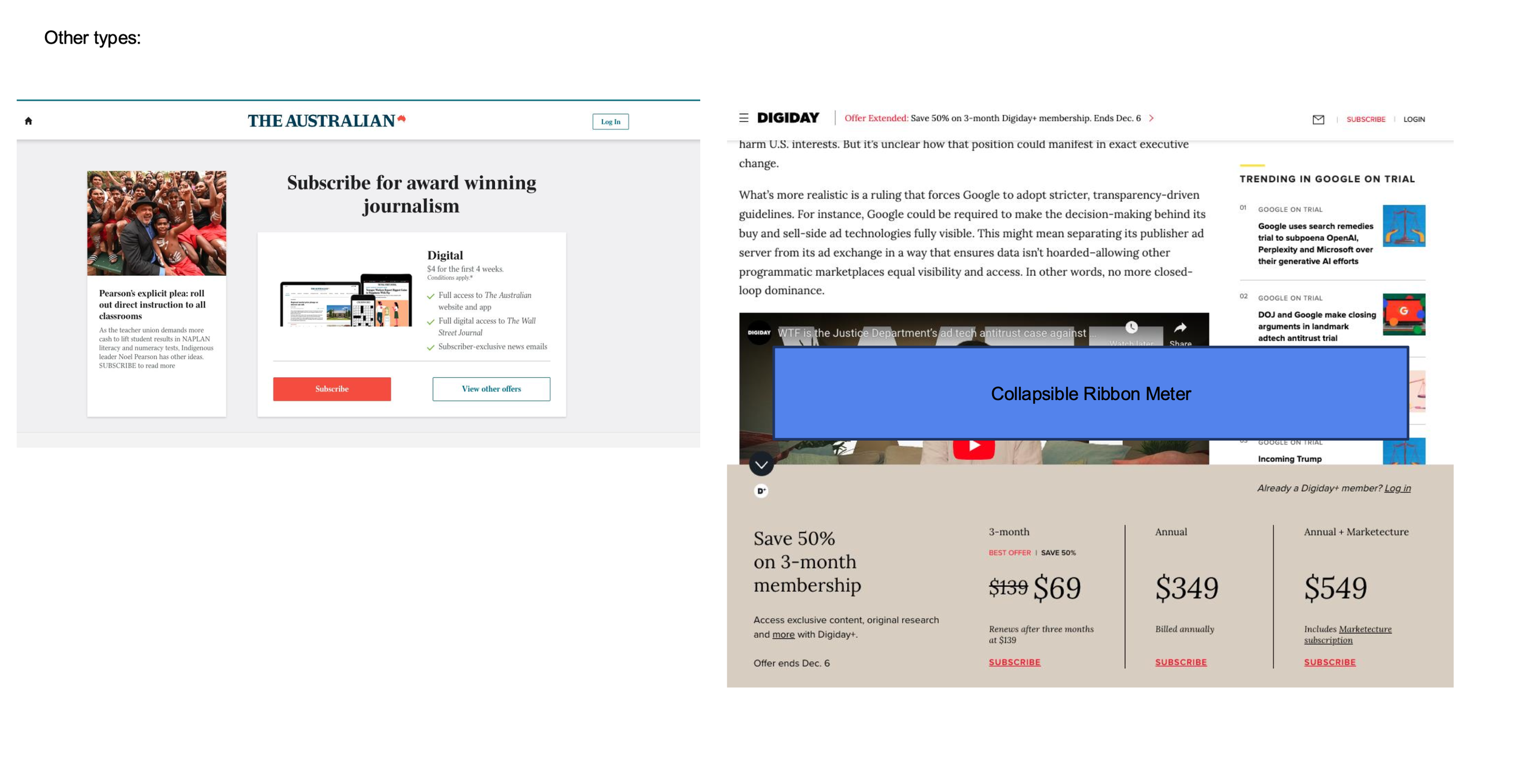
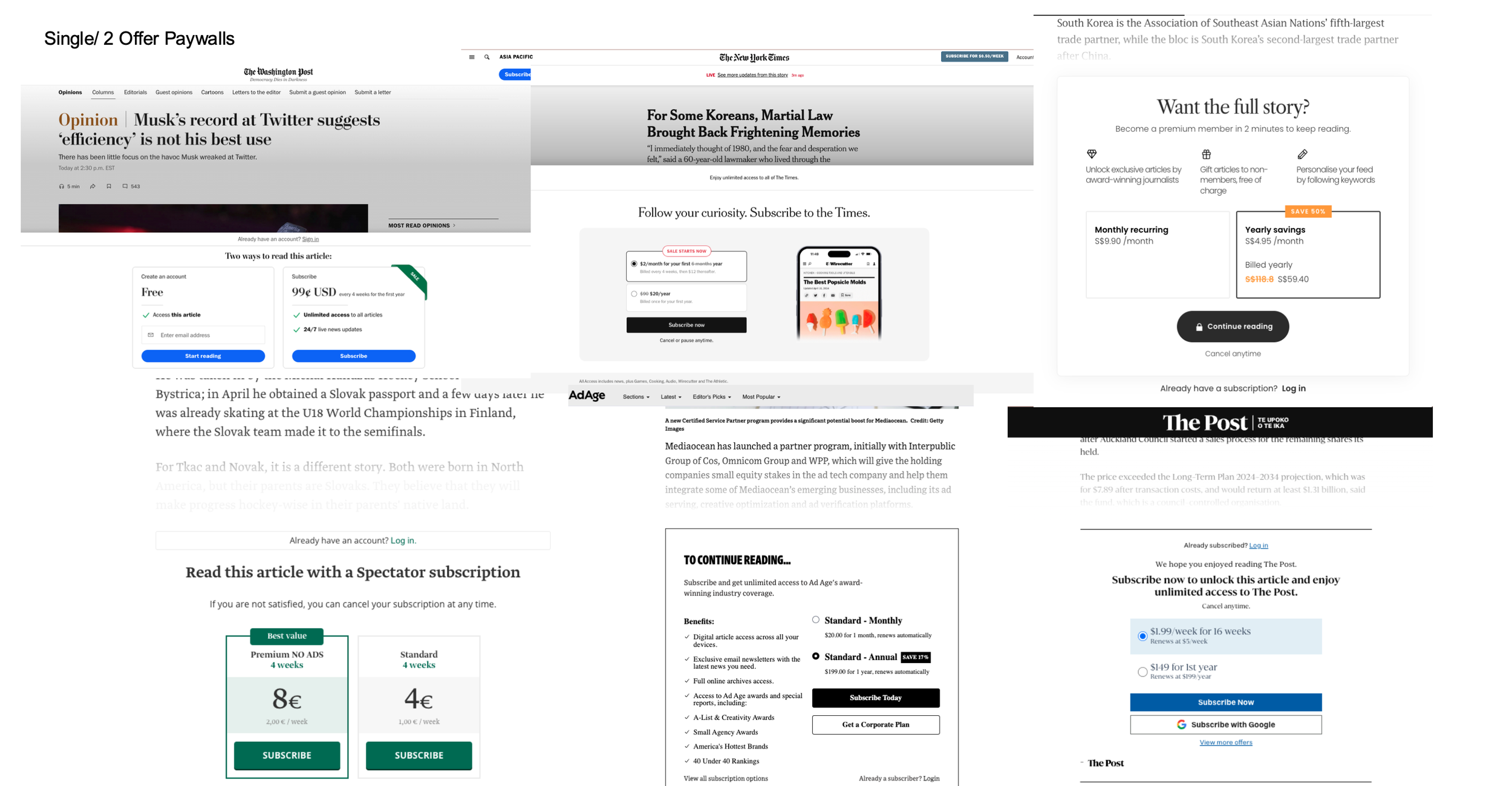
Pattern 1: Progressive disclosure outperforms hard gates
Publishers like Digiday used collapsible ribbon meters to signal article limits without interrupting the reading experience. The meter escalates gradually — a soft reminder first, then a hard gate — giving users time to register the limit before being blocked. This directly informed the bottom banner approach I designed for Boston.com: "YOU HAVE 1 FREE ARTICLE LEFT" before the full paywall screen.
Pattern 2: Single-focused offers convert better than option overload
The Washington Post and The New York Times both offered clean two-path choices at the paywall - free registration versus paid subscription, or monthly versus annual. The clearest performers kept the primary decision simple. Publishers that presented three or more tiers without a clear hierarchy created hesitation rather than conversion. This reinforced my decision to lead Boston.com's paywall with a single offer rather than multiple pricing tiers.
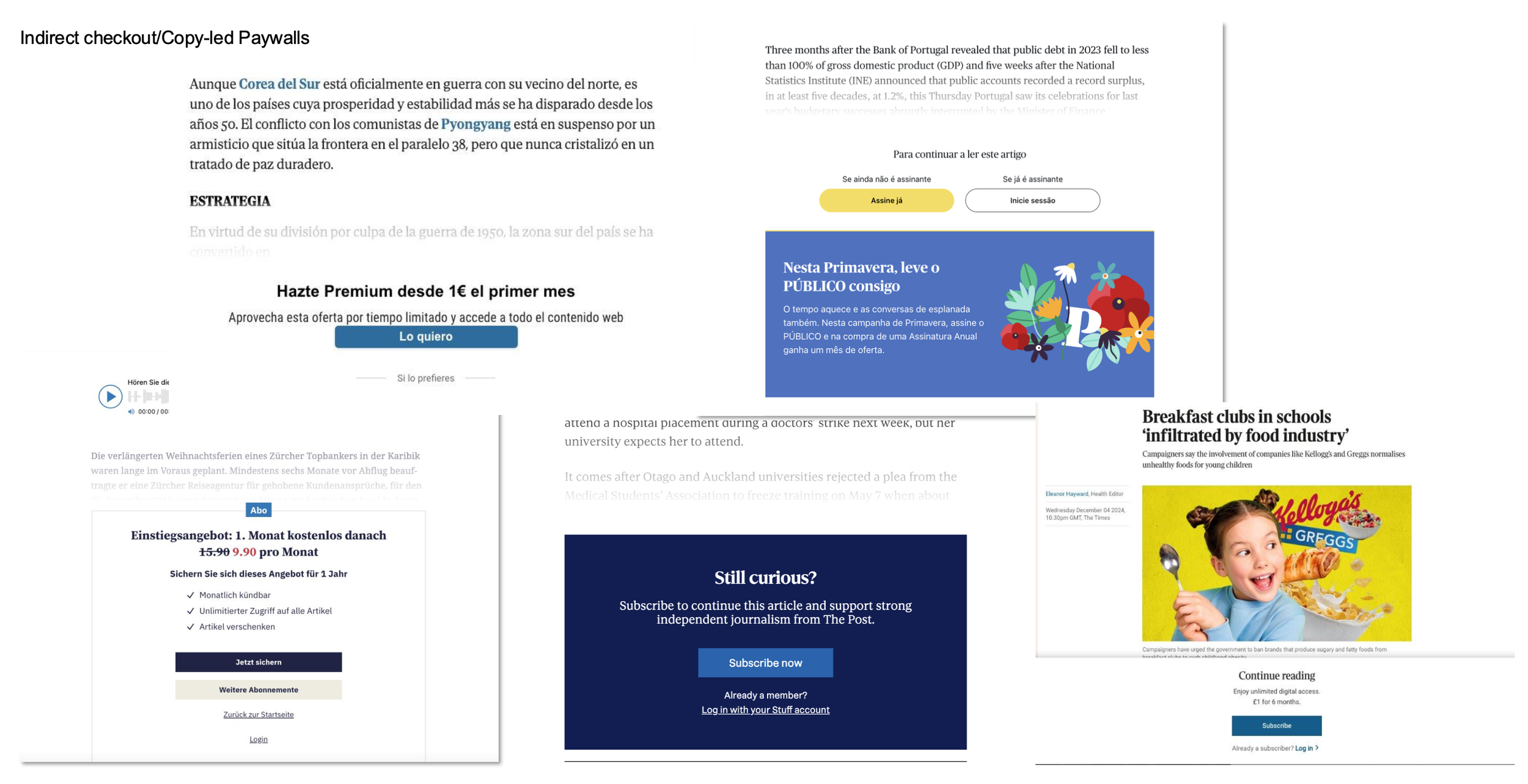
Pattern 3: Value must be stated before price
The strongest subscription landing pages were the Minnesota Star Tribune, the New York Times, and the Atlanta Journal-Constitution, which led with a mission or value statement before presenting pricing. Benefits were itemized clearly alongside the offer. FAQ sections appeared below pricing to reduce commitment anxiety without distracting from the primary CTA. This structure directly shaped the design of Boston.com's subscription landing page.
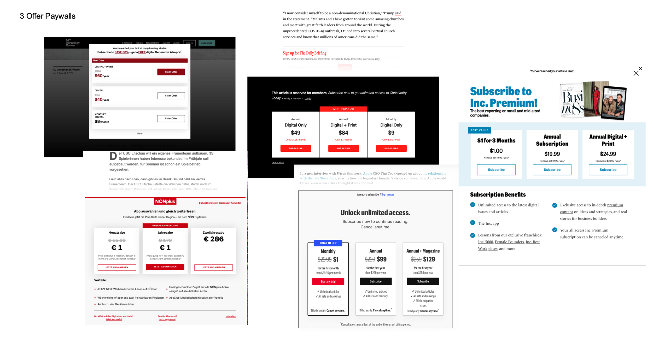
Pattern 4: The decoy effect drives users toward the intended offer
Publishers using three-tier pricing - MIT Technology Review, Inc. Magazine, Christianity Today - consistently highlighted a middle or annual option as "Best Value" or "Most Popular." This anchoring technique makes the recommended offer feel rational rather than arbitrary. While Boston.com's paywall led with a single offer for simplicity, the three-tier structure informed the design of the subscription landing page for users who wanted to compare options before committing.
Each was evaluated for paywall approach, checkout structure, value communication, and post-subscription onboarding. The pattern that emerged: the strongest performers didn't just reduce friction; they made value legible at every step and gave users a clear path back into the product after conversion.
That second part was what happened after conversion; it became a finding I hadn't anticipated.
Problem Statement
How might we design a seamless, low-friction subscription experience that preserves user trust across Boston.com - increasing conversion and reducing drop-off at the point of highest intent?


3.Strategy
With two product teams, a third-party platform partner, shared infrastructure constraints, and a user base that hadn't been asked to pay before, I couldn't design my way out of this problem. The strategy had to work within real organizational, technical, and audience realities.
I worked alongside Piano.io, an external subscription platform partner that shapes the conversion strategy for Boston.com. While Piano brought platform expertise and benchmark data, my role was to translate their recommendations through the lens of Boston.com's specific audience behavior, our research findings, and the design decisions that would make or break conversion.
Three strategic positions I advocated for defined the shape of the final experience.
1. A Metered Paywall Over a Hard Gate — With Three Free Articles
The question wasn't whether to use a paywall. It was how aggressive to make it. Some stakeholders favored a harder gate: a single free article followed immediately by a conversion prompt, with pricing surfaced directly on the article page via a CTA. The logic was simple: maximum exposure to the subscription offer as early as possible.
I pushed back. Based on my competitive review of 11 subscription products, including the New York Times, Financial Times, Minnesota Star Tribune, Spotify, and CNN's new metered paywall, three free articles emerged as the threshold that consistently balanced engagement with conversion pressure. Too few articles, and users hadn't built enough habitual engagement to justify paying. Too many, and the urgency to subscribe diminished.
More importantly, our research showed that 9 out of 10 subscribers cited local news as their primary motivation for signing up. These users weren't casual browsers; they were returning readers with a reason to commit. A metered approach respected that relationship, allowing users to experience the value of Boston.com's journalism before being asked to pay for it. A hard gate at Article One would have interrupted that trust before it had a chance to form.
2. A Stepped Checkout — With Pricing as Its Own Dedicated Moment
The alternative on the table was a condensed single-page checkout with pricing buried in a summary section. Faster to complete, fewer screens, less friction on paper.
I advocated for a step-based flow — Contact → Activation → Payment → Billing — with pricing elevated as a standalone step rather than folded into a confirmation summary. This decision was grounded directly in what research told us.
Users weren't dropping off at checkout because the process was too long. They were dropping off because they felt surprised or uncertain about what they were committing to. Pricing hidden in a summary screen made the most important piece of information feel like fine print. That's not a friction problem; it's a trust problem.
By making pricing a dedicated, visible step, users could clearly see what they were paying, compare the cost against the benefits already presented, and make an informed decision before proceeding. Users who reach checkout have already demonstrated strong intent. At that stage, the goal is not to minimize pricing exposure; it's to help users confidently justify the purchase. Transparency at that moment reduces hesitation, not conversion.
From a business perspective, a subscriber who understands exactly what they're paying for is also a subscriber less likely to cancel. Making pricing legible wasn't just a UX decision - it was a retention decision.
3. Treat the Full Funnel as One Connected System
Rather than scoping the work to checkout alone, I advocated for treating the entire conversion ecosystem as a single connected experience from the first paywall prompt through registration, checkout, and post-subscription onboarding. This meant aligning design decisions across every touchpoint, not just optimizing individual screens in isolation.
This framing also shaped how I approached the post-subscription experience. Our research had surfaced a finding that reframed the project scope: users who successfully subscribed were logging out and not returning for weeks. There was no experience designed to bring them back into content after converting. I flagged this as a retention risk that a checkout-only fix would leave completely unaddressed, and pushed for onboarding to be included in the design scope from the start.
Every strategic decision involved a real constraint: timeline, engineering capacity, organizational structure, or user trust. Here is what I chose and why.
Seamless Experience vs. Platform Constraints → Choose: Globe infrastructure as a foundation, Boston.com experience on top
A fully native Boston.com checkout would have been the ideal solution for continuity. But with a two-week design timeline and an existing Globe checkout infrastructure already in production, rebuilding from scratch wasn't a viable option. I accepted the Globe infrastructure as a foundation and not as a limitation, but as a starting point.
What I pushed for within that constraint was meaningful: rather than inheriting the Globe's single-step checkout with a single payment option, I advocated breaking the flow into individual, dedicated steps — Contact → Activation → Payment → Billing — and expanding payment options beyond what the Globe checkout offered. The infrastructure was shared. The experience didn't have to be.
Brand Continuity vs. Product Efficiency → Choose: Boston.com identity on every user-facing surface
Because the underlying infrastructure belonged to the Globe, there was a real risk that users would feel they had left Boston.com without being told. I prioritized maintaining Boston.com's visual identity—brand colors, typography, logo treatment, and header patterns — that are consistent across the paywall, checkout, and confirmation screens.
The goal was simple: users should feel they never left Boston.com. The structural patterns underneath could belong to the Globe. Everything a user sees and touches needs to feel like Boston.com. Trust at the moment of conversion depends on environmental consistency, where any signal that the user has been redirected introduces doubt at exactly the wrong time.
Friction vs. Trust in Checkout → Choose: Structured transparency over minimal steps
The conventional conversion optimization argument is to reduce steps, use fewer screens, achieve faster completion, and increase conversion. I chose a different position, and research backed it.
Users in our study weren't dropping off because checkout was too long. They were dropping off because pricing and billing terms weren't visible enough, and because the account creation screen looked like a login page, which created confusion at the very first step. Reducing steps without addressing transparency would have improved speed while leaving the trust problem completely intact.
I kept the step-based structure and made the order summary persistent and visible throughout. The friction that needed to be removed was confusion — not steps.
Data Collection vs. User Comfort → Choose: Collect only what's needed at checkout, defer the rest
Research revealed a clear signal: users were uncomfortable providing personal information before fully understanding what they were subscribing to. One participant specifically cited being asked for her phone number and address as a reason for hesitation, as that information felt unnecessary for a digital subscription.
Rather than proposing specific field removals at this stage, I recommended a principles-based approach: evaluate each data field at checkout to determine whether it is truly required for activation, and defer the collection of profile and preference data until after the subscription is confirmed. Users who have already converted are in a fundamentally different mindset — they've committed, trust has been established, and they're more willing to share information in exchange for a better experience. Collecting data at that moment feels like personalization. Collecting it before feels like a toll.
5. User Flow ( After)
The flow below illustrates how users move through the subscription experience, from article consumption and paywall interaction to checkout, activation, and post-purchase engagement.
1.Content Discovery
a. User Goal
Read local news content
b. Business Goal
Drive engagement and subscription intent
b. Key Interaction
User consumes a free article on Boston.com
b. Opportunity
Introduce subscription value without interrupting reading flow
2.Metered Paywall Trigger
a. User Goal
Read local news content
b. Current Pain Point
Subscription messaging appears late in the journey
c. Design Opportunity
Create a softer, progressive introduction to subscription benefits
3.Hard Paywall
a. User State
High intent, but vulnerable to drop-off
b. Friction Identified
abrupt interruption
context switching
limited value reinforcement
c. Strategic Goal
Maintain momentum and trust before redirecting into conversion flow
4. Subscription Offer Page
a. Key Goals
clarify value
simplify decision-making
reinforce benefits
b. UX Decisions
simplified pricing hierarchy
reduced visual noise
scannable benefit list
FAQ support for hesitation points
5. Checkout Experience
Step 1 — Contact Information
Goal:
Reduce onboarding friction
Opportunity:
Support guest-style progression before requiring full account setup
Step 2 — Activation / Account Living
Goal:
Connect Boston.com + Globe ecosystem
Key Product Challenge:
Balancing new account creation with existing Globe subscribers
Step 3 — Payment Method
Goal:
Reduce abandonment
Ux Decision:
Apple Pay / PayPal acceleration
simplified card entry
persistent order summary
Step 4 — Billing
Goal:
Minimize redundant inputs
Ux Decision:
Auto-fill / same-as-contact behavior
6. Subscription Offer Page
Goal:
reinforce subscription success
reduce buyer uncertainty
immediately re-engage users
In conclusion
Rather than optimizing isolated screens, I focused on the broader subscription ecosystem. By identifying key moments of friction, hesitation, and opportunity throughout the funnel, I designed an end-to-end journey that balanced business goals with user needs at every stage — from content discovery and conversion to activation and long-term engagement.
The subscription journey was designed not only to increase conversion but to immediately transition users into long-term engagement behaviors.
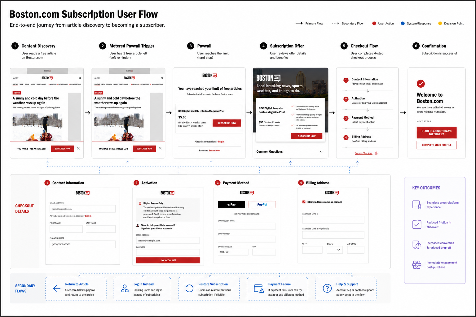
Secondary & Recovery Flows
Additional user states and recovery paths were considered throughout the experience, including:
Returning to the article from the paywall
Logging into an existing account instead of subscribing
Restoring an existing subscription
Payment failure handling and retry flows
These scenarios were intentionally simplified in the visual flow to maintain clarity while still supporting critical edge cases across the subscription journey.
6.Design
Rather than redesigning a single screen, I approached the subscription experience as a connected system — five moments in a single journey, each one building trust before asking for the next commitment.
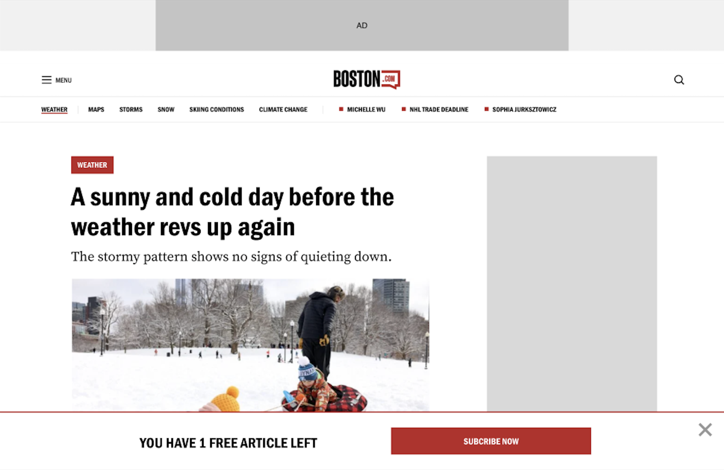
1. The Meter Banner: Signaling Before Blocking
The first touchpoint in the conversion journey isn't a paywall. It's a warning. A persistent bottom banner: "YOU HAVE 1 FREE ARTICLE LEFT" appears before the hard gate, giving users a moment to register that their free access is ending without interrupting the article they're reading.
This was a deliberate choice against the single-article hard gate that some stakeholders favored. The banner respects the user's reading momentum while creating the psychological conditions for conversion, where users who know the limit is approaching are primed to act, not surprised into abandoning.
The banner stays in Boston.com's brand — red CTA, clean typography, dismissible. It doesn't feel like an interruption. It feels like a heads-up.
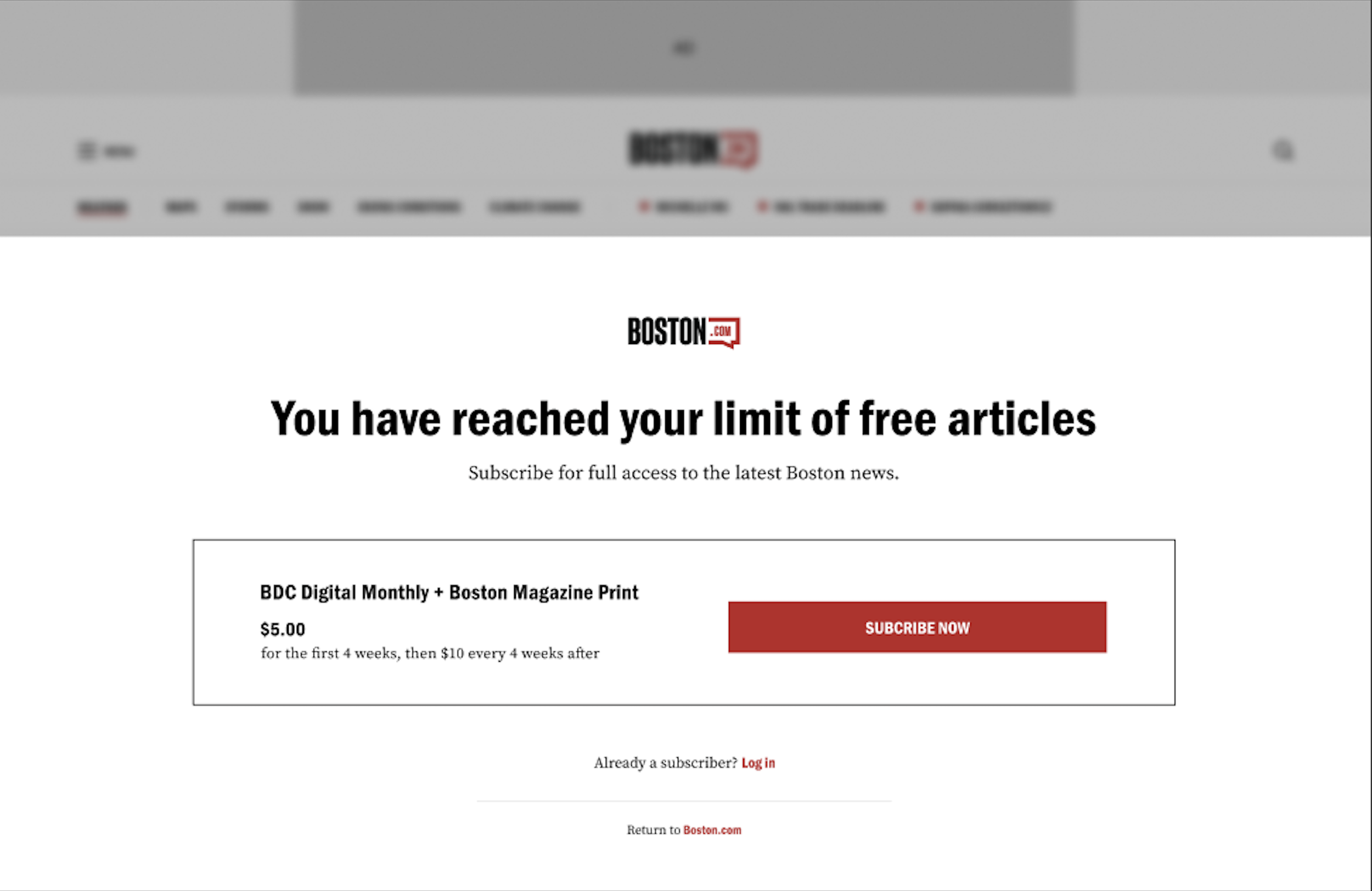
2. The Paywall: One Decision, One Offer
When the meter expires, users see a full-screen paywall — Boston.com logo, a single clear headline ("You have reached your limit of free articles"), one pricing card, and two secondary options: log in if already a subscriber, or return to Boston.com.
The single offer was intentional. Research showed users get overwhelmed by pricing options at the moment of commitment. Rather than presenting monthly, annual, and multi-year tiers, which shift the decision from "should I subscribe" to "which plan is right for me”, I reduced the cognitive load to one question. The offer is clear, the price is visible, the CTA is prominent.
The Boston.com logo anchors the screen. Users never see a Globe logo. The brand continuity that began on the article page carries through to the conversion moment.

4.The Checkout: Structured Transparency
This is the screen that most directly reflects the strategic decisions made earlier in the process.
The checkout is structured into four numbered steps — Contact Information, Activation, Payment Method, and Billing Address. Each step is visible in sequence, so users always know where they are and what comes next. A persistent Order Summary panel on the right shows the total cost at all times — price, tax, and total — so there is no moment of surprise when the final charge appears.
Payment options include Apple Pay, PayPal, and credit card — added directly in response to user research showing that limited payment options were a friction point. The Activation step introduces account linking for existing Globe subscribers, bridging the two ecosystems without forcing users into a new system.
The phone number field — flagged by a research participant as an unnecessary ask for a digital subscription — informed the broader principle applied here: every field present must justify its presence. The checkout asks for what activation requires. Nothing more.
The Boston.com logo appears at the top of the checkout. The Globe infrastructure runs underneath. Users never know the difference.
3.The Subscription Landing Page: Value Before Commitment
For users who click "Learn More" rather than subscribing directly, the landing page leads with the Boston.com brand — a full-width skyline hero image, the logo in prominence, and a value proposition headline that immediately establishes local identity.
Below, a single pricing card presents the offer alongside a benefits checklist: what users get, stated plainly. An FAQ section addresses commitment anxiety before it becomes abandonment. Every element on this page exists to answer one question: "Is this worth it?" The page is designed to say yes before the user has to decide.

5. Post-Subscription Onboarding — The Moment Most Flows Ignore
The confirmation screen is where most subscription experiences stop. This one starts.
Research revealed that users who successfully subscribed were logging out and not returning for days or weeks — not because they regretted the purchase, but because there was nothing to pull them back into the content after converting. This screen was designed to close that gap.
"Welcome to Boston.com" leads with a sense of confirmation and belonging. The order summary on the right provides users with a receipt without them having to hunt for it. Two CTAs give users an immediate next action: start reading today's top stories, or complete their profile. Below both, a "Recommended for You" content feed surfaces local stories immediately — giving users the thing they just paid for before they have a chance to wonder whether it was worth it.
This screen treats conversion not as the end of the journey but as the beginning of the subscriber relationship.

7. Next Steps & Measurements
What Happened & What We Measured
The redesigned subscription experience launched approximately one month before I transitioned off the project. While post-launch performance data was not yet available at the time of my departure, the experimentation framework I built was documented, presented to stakeholders, and active — with A/B tests initiated to validate the core hypotheses.
What I can speak to is the rigor of the measurement approach and what I expected the data to tell us.
The Core Hypothesis
A Boston. com-native subscription experience — one that preserved brand continuity, communicated value clearly at the paywall, and removed trust barriers at checkout — would increase conversion by reducing friction at the highest-intent moment in the funnel.
The secondary hypothesis was equally important: a post-subscription onboarding experience that immediately returned users to content would reduce early churn among newly converted subscribers — thereby addressing the retention gap our research had surfaced.
The Experimentation Framework
I proposed and documented a phased testing strategy organized around the three highest-impact variables identified through research:
Paywall threshold testing — A/B testing article limits to find the threshold that maximizes subscription prompts without eroding Boston.com's role as a free content acquisition channel. The question wasn't just "what converts more users" but "what converts users without damaging the audience habits that make Boston.com valuable as a top-of-funnel asset."
Checkout friction testing — evaluating the step-based flow against alternative layouts to validate that structured transparency outperformed minimal-step approaches for this specific audience. The hypothesis was grounded in research: users dropped off not because checkout was long, but because pricing and commitment details weren't visible enough.
Onboarding engagement testing — Measuring whether the post-subscription content feed and CTAs on the confirmation screen meaningfully changed 7-day and 30-day return rates among new subscribers — the direct measure of whether we had solved the disappearing subscriber problem.
What I Would Have Measured
Had I remained on the project through the measurement phase, these were the primary signals I would have tracked:
Paywall conversion rate: the percentage of users who hit the paywall and completed a subscription, segmented by acquisition source
Check out completion rate by step: to identify exactly where users were still dropping off within the new flow
7-day and 30-day subscriber return rate:the most direct measure of whether onboarding was creating the content habit that prevents early cancellation
Qualitative feedback and support ticket volume: monitoring for confusion, trust gaps, and friction signals in real time, particularly around billing clarity and account creation
These metrics were chosen to evaluate both the immediate conversion impact and the longer-term retention value of the experience because a subscription that converts but doesn't retain is not a solved problem.
What I'd Prioritize Next
If I were continuing to iterate on this experience, the first optimization I'd pursue is paywall messaging personalization to serve different value propositions based on the content category a user was reading when they hit the limit. A user who reads sports coverage daily needs a different reason to subscribe than a user who reads breaking news occasionally. The infrastructure to support this segmentation is in place. The messaging strategy to leverage it does not yet.
8. Conclusion
This project taught me that conversion problems are often organizational problems wearing a UX costume.
The checkout wasn't broken because of bad design. It was broken because two teams owned adjacent parts of the same journey with no shared accountability for the seam between them. The design solution was secondary to the strategic reframe: making the case that this was a systems problem, not a page problem.
By unifying the paywall, checkout, and onboarding into a single experience, the design shifted the subscription from a transactional interruption to a trust-building moment in the reader's relationship with Boston.com. That system shipped, and the experimentation framework to validate and iterate on it was already in motion.
What I'd do differently: I'd invest earlier in quantifying the cost of the broken handoff in dollar terms and not just drop-off rates. Making the business case with revenue-impact data would have accelerated stakeholder alignment and helped prioritize this work even sooner, against competing initiatives.