Reimagining the Boston.com App Experience
Role: UI Designer
Duration: 4 weeks
Tools: Figma
Boston.com is in the middle of a difficult transition — from a free, high-traffic utility to a subscription product that must justify its cost.
Boston.com launched in 1995 as a free companion to The Boston Globe, built on the premise that local news should be accessible to everyone. For nearly three decades, that model held. In 2025, it began to shift: a metered paywall and bundled subscription offering changed the product's fundamental contract with its users.
That shift created a design problem with real stakes. When a product moves from free to paid, the experience itself becomes part of the value proposition. Users who previously tolerated friction now have a choice. Every rough edge, every cluttered feed, every passive reading moment becomes a reason not to subscribe.
This case study documents a mobile redesign exploration focused on three questions:
How should the information hierarchy change when content must earn attention, not just capture it?
What interaction patterns support session depth and return visits — the behaviors that drive subscription conversion?
How do you modernize a news product without abandoning the utility that made it trusted in the first place?
Project context: This was a self-initiated redesign exploration. I selected Boston.com because the subscription pivot creates a genuine product design challenge with clear success criteria. The work focuses on the mobile experience — the primary surface where subscription value is won or lost.
1. Objective
This redesign was driven by a user-need-first lens — specifically, the need to combat information overload, reduce friction in content discovery, and build the daily reading habits that turn casual browsers into engaged, returning readers.
Boston.com has historically been one of Boston Globe Media's strongest channels for reader engagement. App users spend significantly more time consuming content and return more frequently than web users. But both web and app readership were declining — creating a clear opportunity to improve how readers discover, navigate, and consume content within the mobile experience.
This redesign had three objectives, each tied directly to the engagement problem:
1. Make hierarchy do the work of discovery.
A high-volume content feed creates noise, not discovery. Readers shouldn't have to work to find what's relevant to them. The redesign needed to prioritize signal over volume — surfacing the right story, at the right weight, at the right moment in the session.
Boston.com's strength is its utility — local, timely, and trusted. The visual redesign had to feel elevated without feeling unfamiliar. Readers needed to recognize the product they already use, which is working significantly better for them.
The primary outcome I was optimizing for was engagement, not subscription conversion.
Session duration
Is the experience holding attention or losing it?
The redesign prioritized engagement as the leading indicator of success. Retention and subscription conversion were treated as lagging indicators, expected to improve as readers spent more time engaging with content.
2. Constraints

2. Design for session depth, not just entry points.
A reader who opens the app, reads one article, and closes it is not an engaged reader. The redesign needed to reward continued exploration — creating natural pathways from one story to the next, and from one section to another, so that a single visit becomes a longer habit.
3. Modernize the experience without erasing the utility.
This distinction matters. Boston.com is a content discovery and engagement platform. Subscription conversion is downstream of engagement — before a reader will pay, they need a product experience that earns their attention, rewards their return visits, and builds a habit. Subscription conversion is harder to earn before that habit is established.
This project focused on the behaviors that precede conversion:
Articles viewed per session
Are readers going deeper, or bouncing after one story?
Content discovery across section
Are readers finding content beyond what they came for?
Return visit frequency
Are readers building a daily habit around the product?
This redesign operated within a specific technical and product ecosystem that shaped every decision.
The platform: Pugpig
Boston.com's mobile app is built on Pugpig, a publishing platform used by major media companies for mobile content delivery. Designing within Pugpig meant working within its existing architecture and out-of-the-box feature set — proposed solutions needed to be supportable without extensive custom development. This ruled out certain interaction patterns and required all design decisions to remain compatible with the platform's content rendering capabilities.
Additional constraints:
Use Boston.com's existing styles and design system — extend, don't replace
Work within the mobile web layout structure
Minimize decisions that would require app-specific editorial overhead
Prioritize speed to market, consistency, and ease of maintenance
The decision I wanted to make but couldn't:
The constraint that most directly shaped the redesign was the inability to introduce carousel-based content modules on the homepage.
Boston.com publishes a high volume of content across multiple categories, and the existing experience relies heavily on vertical scrolling. My hypothesis was that strategically placed carousels — for sections like Trending, Most Read, Sports, or personalized recommendations — could meaningfully improve content discovery. Users in exploration mode could browse more stories within a smaller vertical footprint, reducing scroll fatigue while increasing exposure to content across categories. I believed this pattern could directly move articles viewed per session, one of the primary engagement metrics for this redesign.
Pugpig's architecture made this pattern unfeasible without significant custom development — outside the scope of this project.
What I did instead: I focused on improving hierarchy, content organization, and visual rhythm within the platform's existing vertical layout. Rather than changing the interaction model, I changed the information model — making the existing scroll pattern work harder through stronger card differentiation, clearer section structure, and more intentional content sequencing.
3. Scope
Rather than redesigning every surface of the Boston.com app, I focused on the areas with the highest leverage on reader engagement — the primary metric this redesign was built to move.
Why these surfaces and not others:
Boston.com's paywall is not the first experience readers encounter. Users can freely browse the homepage, explore content categories, and evaluate the product long before they are asked to subscribe. Even after reaching their free article limit, readers can continue exploring the homepage — the paywall only appears when they attempt to access an additional article.
This structure meant that the homepage and article experience were the primary drivers of subscription intent, rather than the paywall itself. Before a reader will pay, three things need to happen first: they need to discover content that feels relevant, develop trust in the editorial product, and build a habit of returning. The paywall is downstream of all three.
The redesign therefore focused on the surfaces where those behaviors are formed — not the moment where conversion is asked for.
The four surfaces, and why each was prioritized:
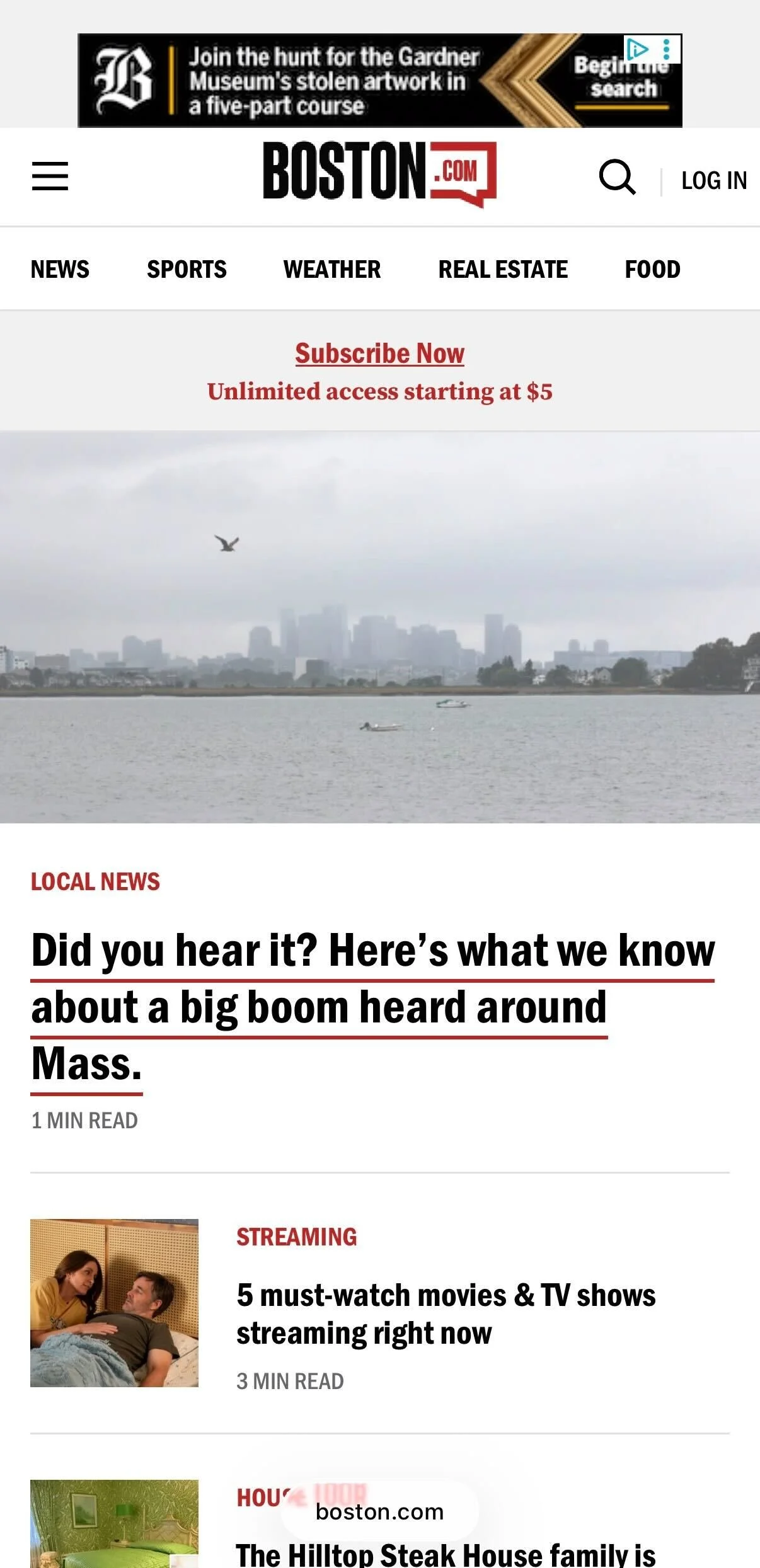
1. Homepage / Feed Experience
The primary gateway to Boston.com's content ecosystem. Internal patterns showed that readers who regularly engage with the homepage are more likely to convert to subscribers — and existing subscribers who engage with it regularly are less likely to churn. This made the homepage both a discovery surface and a retention surface. The redesign focused on making content easier to browse, establishing clearer editorial hierarchy, and creating a more consistent experience that rewards return visits and builds daily reading habits.
2. Article Reading Experience
Where engagement deepens. The homepage brings readers in — the article experience determines whether they stay. Improvements to readability, content hierarchy, and in-article navigation were designed to reduce friction between stories and make it easier for readers to continue exploring rather than closing the app after a single article.
3. For You / Save Section
A personalization surface that signals editorial intelligence. Readers who feel the product understands their interests return more frequently. This section was redesigned to feel like a curated destination rather than a passive bookmark folder — reinforcing the sense that Boston.com is a product worth coming back to.
4. Key UI Patterns & Components
The foundational layer that makes everything else consistent. Without a coherent card system, type hierarchy, and media treatment, improvements to individual surfaces would feel disconnected. The component work was what allowed the redesign to feel like a system rather than a collection of individual screen refreshes.
Onboarding and the paywall gate were out of scope for this exploration. Both are high-leverage surfaces for conversion — and in a live product engagement, they would be the natural next phase of this work. The hypothesis driving this redesign was that improving the engagement layer first would make conversion efforts downstream more effective. A reader who already has a strong product habit is a meaningfully easier subscriber to acquire than one who hasn't yet found their reason to return.
What was intentionally left out:
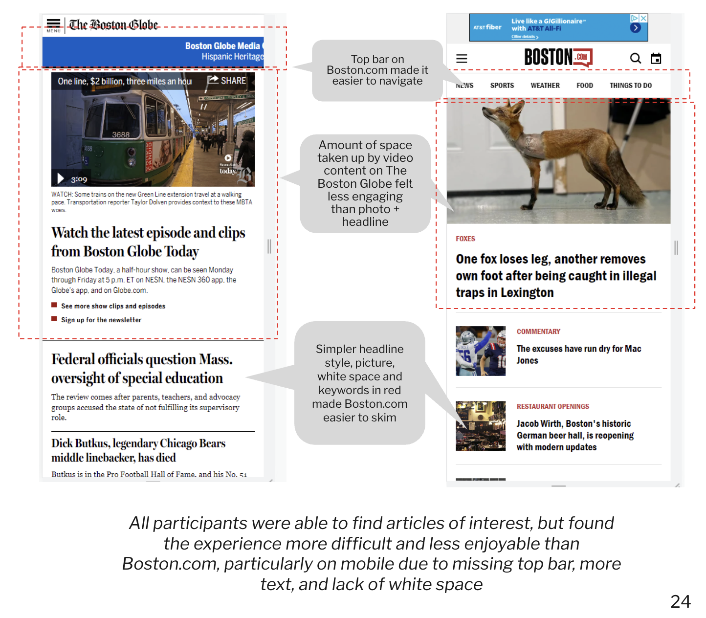
4. Before: Where the Experience Falls Short
The audit that shaped this redesign was not based on personal observation alone. It was grounded in two layers of research: an existing internal discoverability report commissioned by Boston.com, and a series of user interviews I conducted with frequent Boston.com users prior to beginning the redesign.
Research foundation:
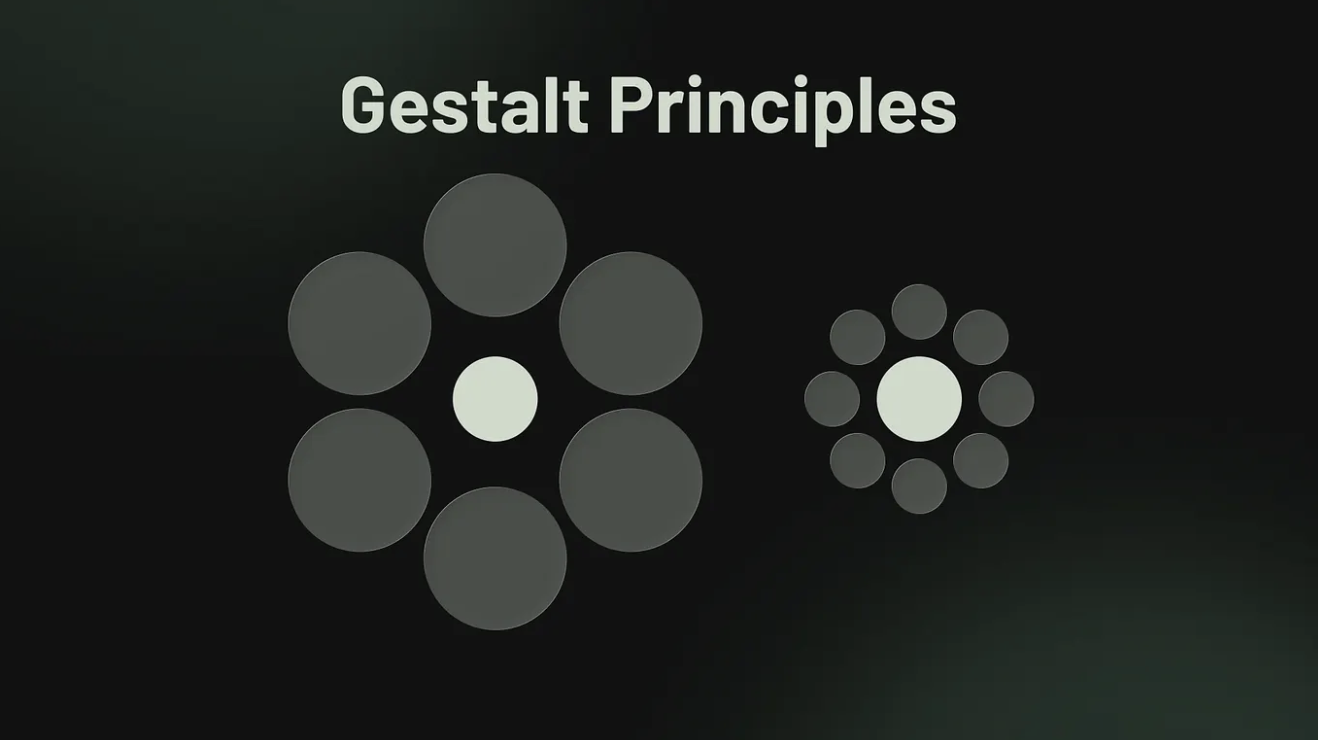
The internal discoverability report — a formal heuristic evaluation conducted using Nielsen Norman Group usability principles, Information Architecture heuristics, and Gestalt principles — established the baseline. It identified content discoverability, navigation consistency, and information density as the platform's three most significant structural weaknesses. Key findings included a Findability score of 2/5, a Controllability score of 2/5, and a Delightfulness score of 2/5 — the three lowest scores across the entire IA evaluation.


5. Design Principles
To validate whether those findings still reflected current user behavior, and to understand how reader expectations had evolved, I conducted interviews with frequent Boston.com users. Participants were defined as readers who visited the platform at least once daily. The interviews focused on three questions: what keeps them coming back, what frustrates them, and what would make the experience feel worth paying for.
Together, these two inputs shaped the audit below.
What the research revealed: three systemic failures
Systemic Failure 1: The experience cannot guide attention.
The discoverability report found that within the first 900px of the mobile homepage, users encountered between 39 and 42 individual elements to parse — headlines, images, ads, navigation items, and topic labels competing for attention simultaneously. Research shows users spend only 10 to 30 seconds scanning a page, reading approximately 20–28% of words on screen. At that density, the experience doesn't guide attention — it floods it.
User interviews confirmed this at the behavioral level. Frequent readers reported relying almost exclusively on the homepage to navigate the entire site, scanning for what felt most important and relevant. When the hierarchy failed to surface that clearly, readers disengaged rather than searched.
The root cause: the absence of a hierarchy model in the design system. Every content type — hero stories, secondary stories, breaking news, ads — occupied the same visual register. When everything is emphasized, nothing is.
Business impact: The discoverability report found that only 6% of Boston.com's audience accounted for 60% of pageviews. The experience was optimized for its most loyal readers — who already knew where to look — while failing to guide the infrequent and new readers who represent the highest conversion opportunity for subscriptions.
Systemic Failure 2: Content discovery stops at the headline.
A recurring finding across both the discoverability report and user interviews was that Boston.com's content breadth was largely invisible to readers. The discoverability report identified inconsistent topic labeling, unpredictable content placement, and limited navigation options as the primary barriers. It found that topic wells — the strongest content grouping signal on the homepage — were positioned so far down the page that most readers never reached them.
User interviews surfaced the behavioral consequence directly. Readers described the homepage as their primary — and often only — navigation tool. They rarely used the navigation bar or menu. They scanned the homepage, clicked individual stories, and returned. When the homepage failed to surface relevant content quickly, readers left rather than explored.
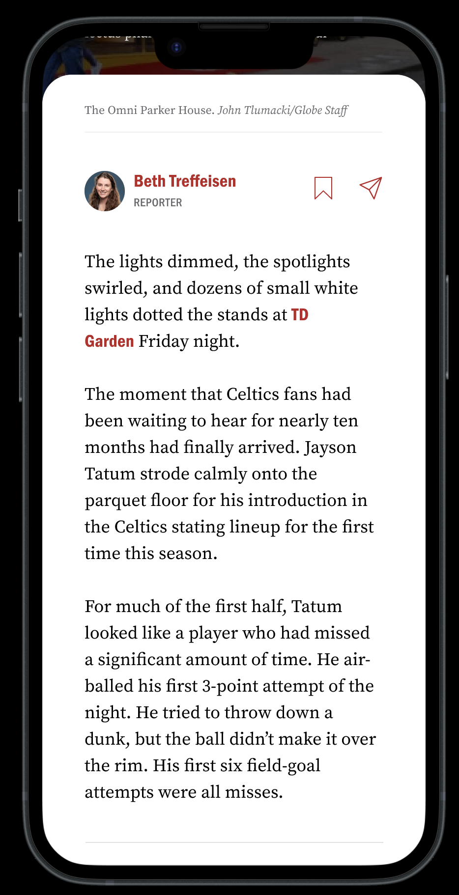
One participant described the related content experience: "When I see the score of the Celtics game, and it says below click here for more, I'm expecting to see more about the game, but instead it's just old articles about the Celtics — which is kind of annoying."
The root cause: the recommendation and related content systems were not designed with reader intent in mind. They surfaced volume rather than relevance, creating the impression of depth without delivering it.
Business impact: Low content discovery directly suppresses articles viewed per session — the primary engagement metric this redesign was built to move. Readers who find one story and leave are not building the habits that precede subscription conversion.
Systemic Failure 3: The component system has no logic.
Across both research inputs, inconsistency emerged as a persistent theme — not at the individual-screen level but at the system level. The discoverability report gave Boston.com a Learnability score of 3/5, citing inconsistent site-wide navigation, inconsistent content placement, and inconsistent topic labeling as the primary contributors.
User interviews revealed specific examples: participants were unsure whether the news page and the front page were distinct surfaces. The "Metro" category label was not understood — readers looked for "Local." Navigation tap targets were too small, resulting in mis-taps. Tabs were not noticed or understood.
These are not isolated UI problems. They are symptoms of a component system that grew without rules — where individual design decisions were made in isolation rather than within a coherent system.
The root cause: the absence of a component logic — a defined set of rules governing when to use which card type, label style, or navigation pattern, and why.
Business impact: Inconsistency creates cognitive load. Cognitive load erodes trust. For a product asking readers to pay, trust is not optional.
Prioritization: If I could only fix three things
Not all problems carry equal weight. Based on the research, I prioritized in this order:
1. Hierarchy model — highest priority. Without a clear visual hierarchy, no other improvement compounds. Better cards in a broken hierarchy system still fail to guide attention.
2. Article engagement architecture — second priority. This is where subscription value is either proven or lost. A reader who finishes an article and has nowhere to go is a churn risk. Fixing the post-article experience directly impacts session depth and return visits.
3. Component consistency — third priority. Inconsistency is invisible to individual users but corrosive over time. Fixing the component logic is what allows the first two improvements to hold at scale.
These principles were not defined in a workshop. They were derived from two layers of research — an internal discoverability audit and user interviews with frequent Boston.com readers — and refined through the constraints of designing within the Pugpig platform. Each principle resolves a real tension this project faced.
1. Guide attention, don't compete for it
The discoverability report found 39–42 individual elements competing for attention within the first 900px of the mobile homepage. User interviews confirmed the consequence: readers relied almost entirely on the homepage to navigate the entire product, scanning quickly and disengaging when nothing clearly stood out.
This principle meant: every design decision had to reduce competition and increase clarity. Cards, headers, imagery, and ads needed to operate within a defined hierarchy — not fight for equal footing.
Tradeoff accepted: Lower content density on the homepage. Fewer stories visible above the fold. This was a deliberate choice — in an engagement-first product, density creates noise, not discovery.
Where you'll see it: Hero treatment, card weight differentiation, section structure.
2. Design for the returner, not just the first-time visitor
Boston.com's most valuable audience — the 6% of users who account for 60% of pageviews — are habitual readers. They visit daily. They scan the homepage. They know what they're looking for. But the experience was not designed to reward that behavior. Navigation was inconsistent. Content placement was unpredictable. Related content surfaced volume instead of relevance.
This principle meant: every surface needed to support the habit loop — easy entry, fast scanning, natural continuation. A reader who returns daily should feel the product getting easier and more rewarding over time, not harder to navigate.
Tradeoff accepted: Optimizing for returners meant some decisions that might improve first-time discovery were deprioritized. Onboarding and paywall experiences were explicitly left out of scope.
Where you'll see it: Homepage structure, content sequencing, post-article experience.
3. Editorial feel, product precision.
User interviews revealed a tension unique to Boston.com's audience: readers valued the brevity and density of the content — they explicitly did not want a picture-heavy, magazine-style experience. At the same time, the product needed to feel elevated enough to justify a subscription.
This principle resolved that tension. Editorial feel meant: treat content with the visual authority of a trusted news publication — strong typography, intentional hierarchy, clear section identity. Product precision meant: don't let editorial ambition create inconsistency, slow performance, or visual noise.
Tradeoff accepted: This principle constrained how far the visual redesign could go. Full-bleed imagery and cinematic moments were used selectively — only where they added editorial authority without sacrificing the density loyal readers depend on.
Where you'll see it: Typography system, hero treatment, card design, article reading experience.
4. Consistency as a trust signal
The discoverability report gave Boston.com a Learnability score of 3/5 and a find-ability score of 2/5 — both driven primarily by inconsistency. Navigation items changed across pages. Topic labels were applied unevenly. Card patterns varied without logic. User interviews revealed the human cost: readers couldn't tell whether the news page and the front page were different. The "Metro" label confused people looking for "Local."
For a product moving toward subscriptions, inconsistency is not a polish problem — it is a trust problem. Readers who feel confused are not confident about paying.
This principle meant: every component needed a rule. When to use which card type. How labels behave. How navigation persists. The redesign had to feel like a system, not a collection of individual screen decisions.
Tradeoff accepted: Consistency within the Pugpig platform meant some visually interesting patterns were not feasible. The constraint was accepted because a consistent experience that works beats an inconsistent one that occasionally surprises.
Where you'll see it: Component system, navigation behavior, card hierarchy, label usage.

6. After: Reimagining BDC App
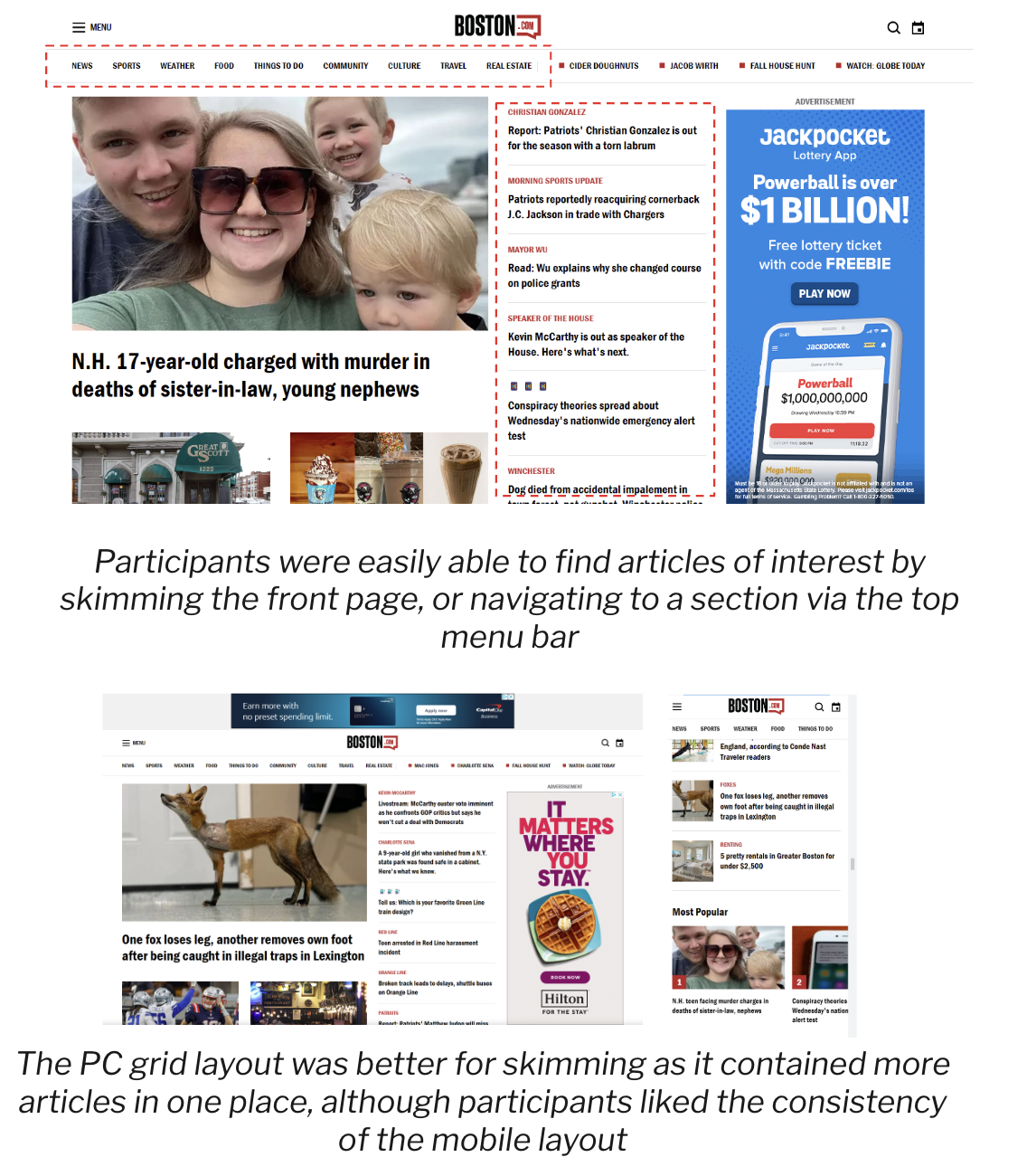
The homepage redesign addressed a single core problem identified in the research: the existing experience treated all content as equally important. With 39–42 elements competing for attention within the first screen, readers had no visual guidance for where to look first, what mattered most, or where to go next.
The redesign introduced a structured content hierarchy system — a layered approach where visual weight communicates editorial priority, and each section of the homepage serves a distinct role in the reading session.
Interested in seeing the full experience? Interactive prototypes and supporting design documentation are available upon request.
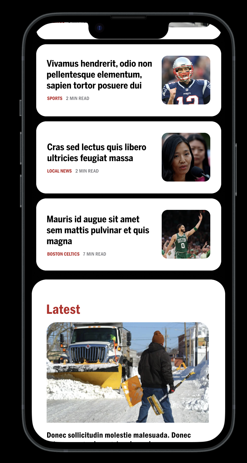
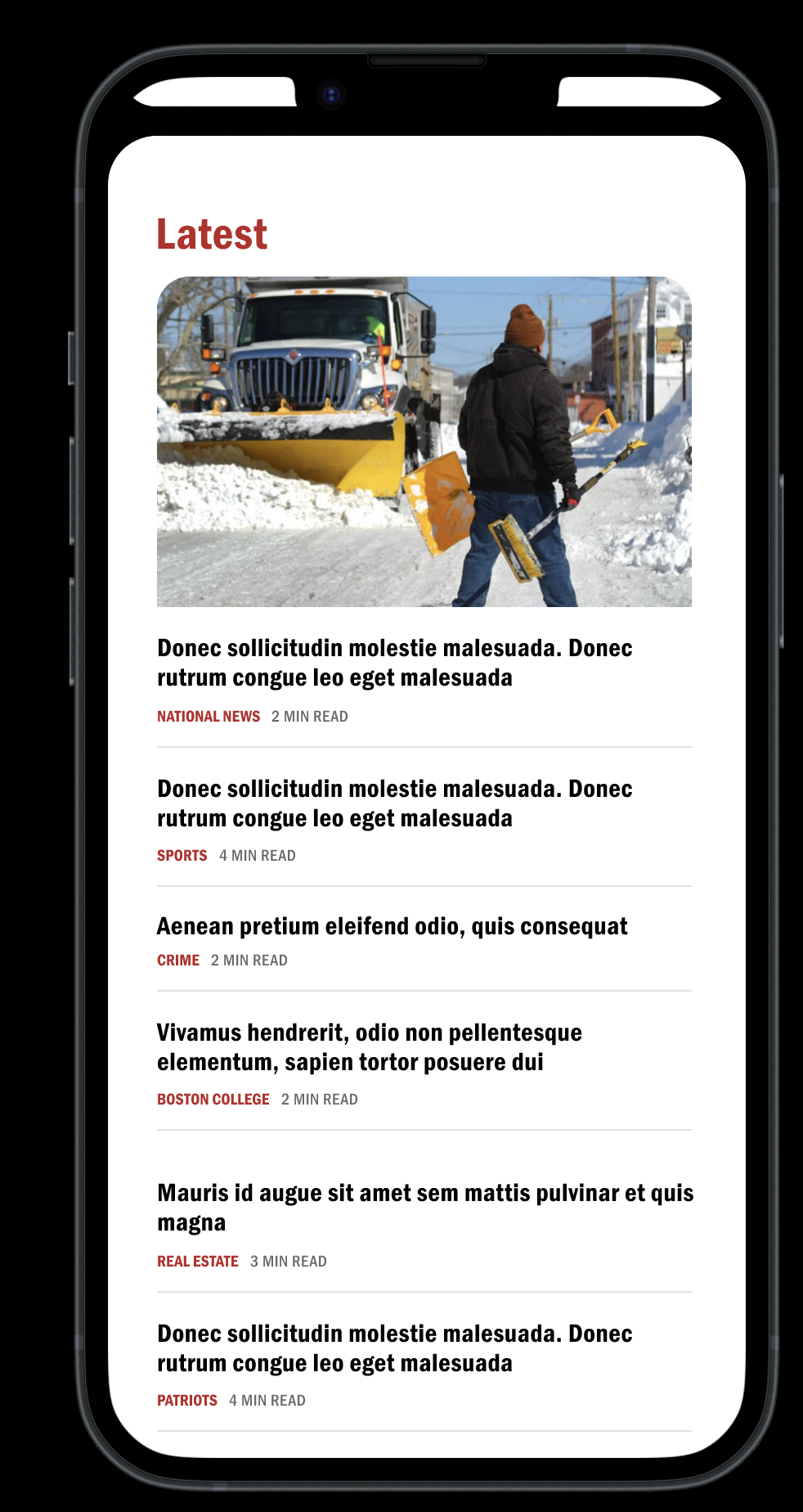
3. The "Latest" section separated real-time content from curated content
The decision: A dedicated "Latest" section was introduced, featuring a lead image card followed by a compact, text-only list—headline, category label, and read time —separated by thin dividers. No secondary images. Maximum density, minimum friction.
Why it matters: User interviews revealed that frequent readers visit Boston.com specifically to see what's happening right now. They scan headlines quickly and don't need imagery to make reading decisions on time-sensitive content. The text-only list format within "Latest" was a deliberate nod to that behavior — respecting the reader's preference for headline density while keeping the section visually distinct from the curated editorial sections above it.
Tradeoff: This section intentionally reduces image real estate, which runs counter to the visual elevation goal in other parts of the redesign. The decision was grounded in research on loyal reader behavior — they value brevity and density in breaking news contexts.
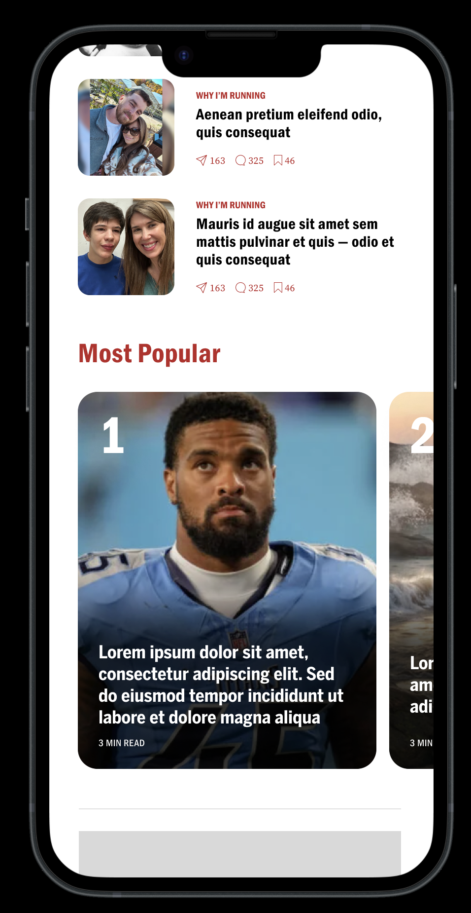
5. Engagement signals were introduced at the card level
The decision: Section-specific card layouts (Image 4) introduced share, comment, and bookmark affordances directly on content cards — visible counts alongside each icon showing social engagement volume per story.
Why it matters: The original experience offered no signals about which stories were generating conversation or reader interest. Adding engagement counts to cards gives readers a secondary discovery signal — not just "what is Boston.com covering" but "what is Boston.com's audience engaging with." This pattern directly addresses the discoverability report's finding that Boston.com had no mechanism to help readers identify which content was resonating beyond editorial placement alone.
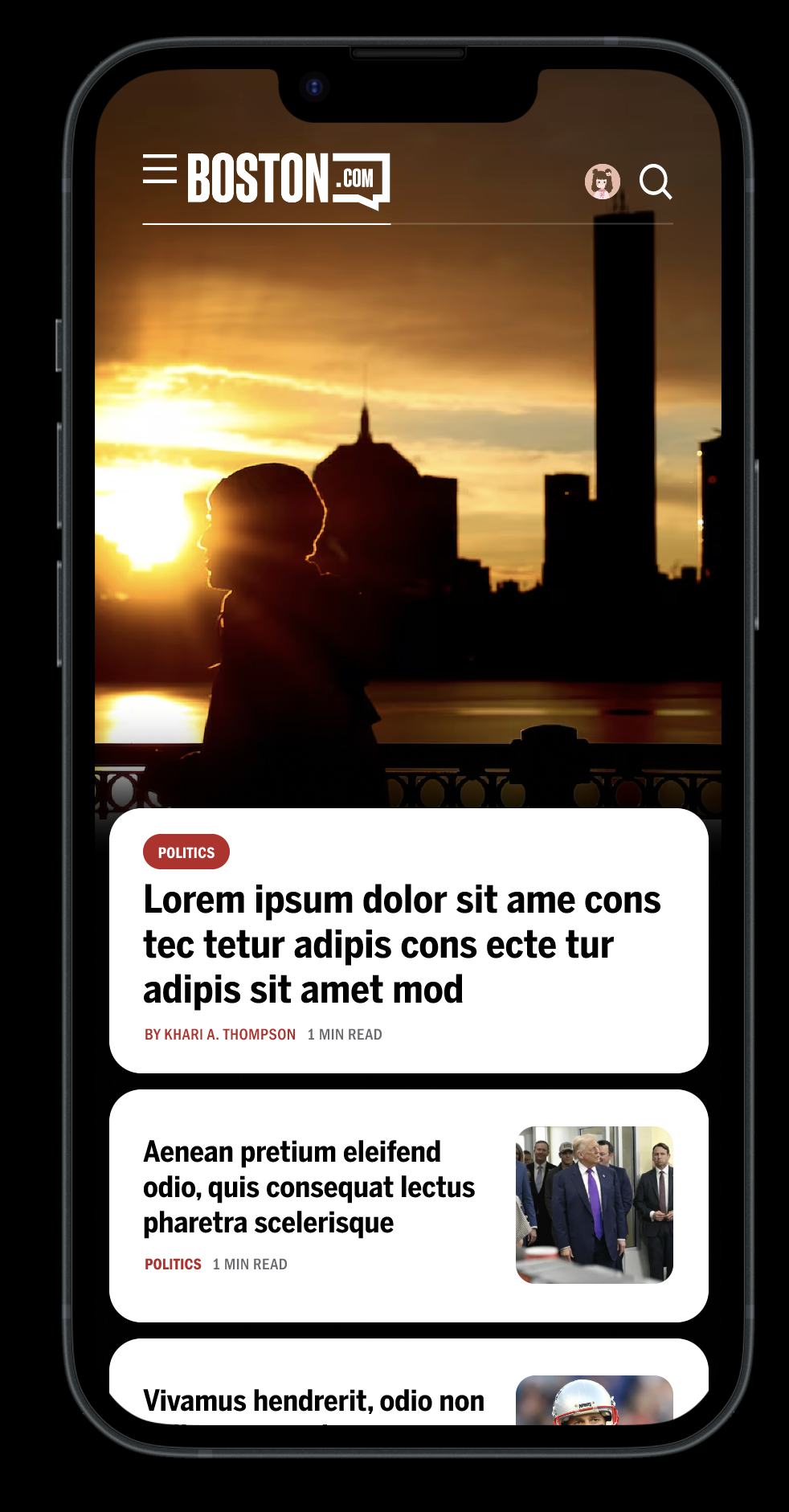
1. The hero became an editorial statement, not a large thumbnail
The decision: The top story was redesigned as a full-bleed immersive moment — edge-to-edge photography that commands the full screen, with the headline, category label, author, and read time surfaced on a floating content card below the image. The headline type was set to display scale, with enough weight to communicate that "this is the most important story on this page". without needing to read it.
Why it matters: In the original experience, the hero story occupied the same visual register as secondary content — a large image with overlaid text that varied in contrast depending on the photograph. Readers had no reliable signal for what the lead story was. The redesign separates the image layer from the content layer entirely, making the editorial priority legible regardless of what photo is used.
The constraint it solved: User interviews found that readers scan the homepage in 10–30 seconds and read approximately 20–28% of what's on screen. The hero needed to communicate story importance before a word was read. The floating card below the image achieves this — category, headline, and time commitment are all visible at a glance.

2. A three-tier card system replaced uniform content treatment
The decision: Secondary stories below the hero use a horizontal thumbnail card — with the headline on the left, the image on the right, and the category label and read time below. This pattern repeats consistently throughout the feed.
Why it matters: The original feed used inconsistent card treatments that gave readers no visual logic for scanning. The redesigned card system establishes a clear rule: the hero owns the full screen; featured secondary stories use the horizontal thumbnail card; text-heavy content uses a compact list format. Each format signals a different content weight without requiring the reader to consciously interpret it.
The research connection: The discoverability report identified inconsistent content placement as a primary barrier to topic recognition. A consistent card system builds the pattern recognition that allows habitual readers to scan faster over time — directly supporting return visit behavior.
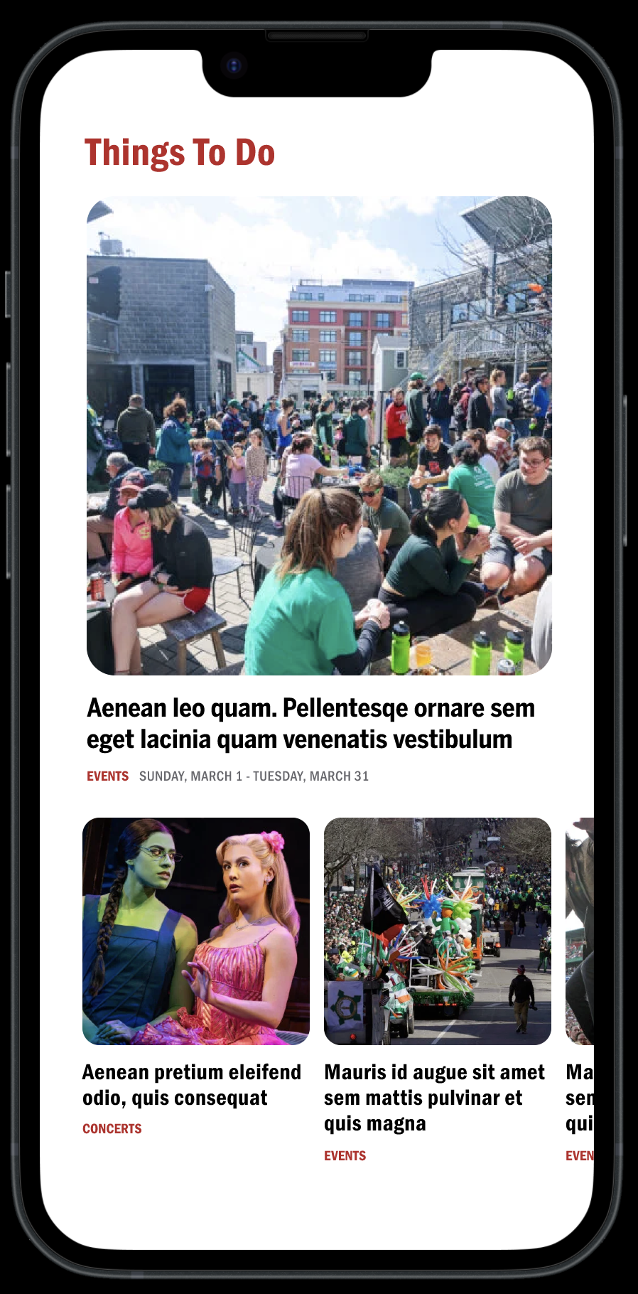
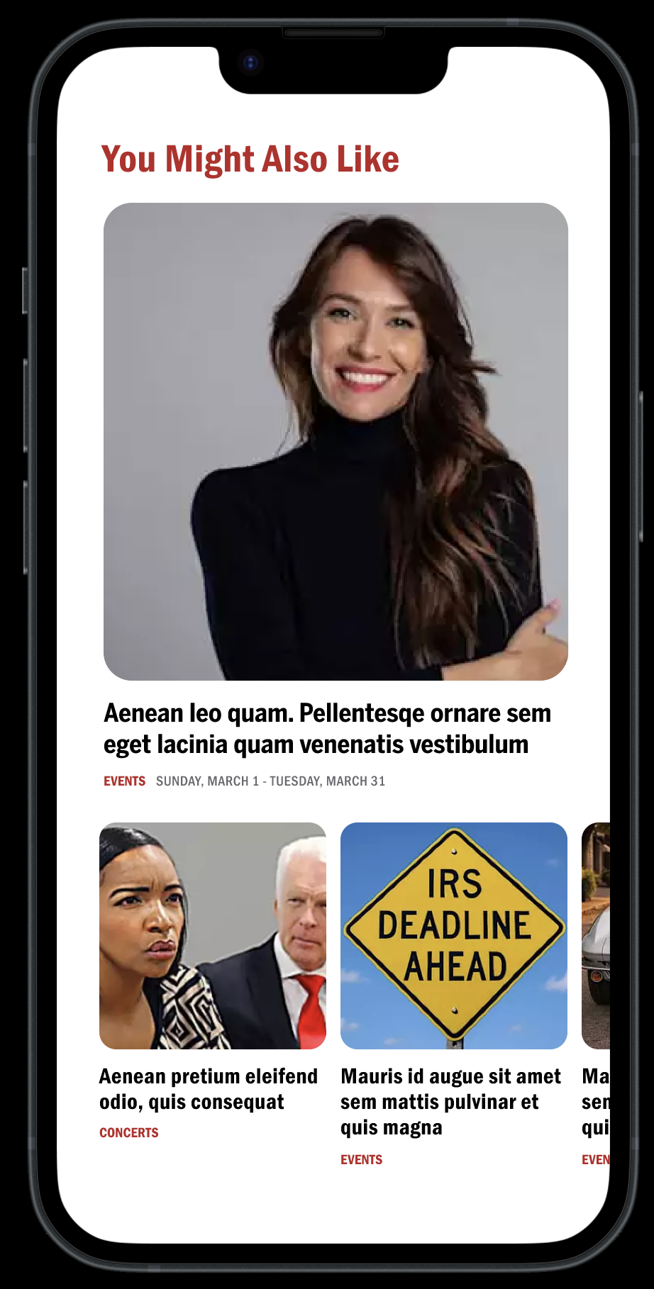
4. Section-based browsing replaced the undifferentiated vertical scroll
The decision: The homepage was reorganized into named, visually distinct sections — News, Sports, Things To Do, Most Popular, You Might Also Like — each with its own lead treatment and sub-content pattern. Section headers use the Boston.com red at display scale, creating clear visual breaks between content categories.
Why it matters: The discoverability report found that topic wells the strongest content grouping signal on the original homepage — were positioned so far down the page that most readers never reached them. By bringing section structure into the primary scroll experience, the redesign makes Boston.com's breadth of content visible during a normal reading session, not just to readers willing to scroll to the bottom.
The carousel solution within constraints: The "Most Popular" and "Things To Do" sections introduce horizontal scrolling modules — a partial solution to the carousel problem that Pugpig's architecture constrained. While full interactive carousel modules weren't feasible, horizontally scrollable image grids within fixed sections achieved the same core goal: allowing readers to browse more content within a smaller vertical footprint without extending page length.
Outcome
The redesigned homepage transforms an undifferentiated content stream into a structured editorial system. Each section has a defined role: the hero establishes editorial authority, the card feed supports rapid scanning, the Latest section supports real-time news behavior, named sections make content breadth visible, and engagement signals provide a social discovery layer for readers.
The measure of success is not visual polish — it is whether readers who open the app find relevant content faster, explore more sections per session, and build the daily habit that makes Boston.com worth returning to.
B: Reimagining the Article Experience
The article redesign was built around one insight from the research: the reading experience is where subscription value is either proven or lost. A reader who finishes an article and has nowhere meaningful to go is a churn risk. A reader who finishes an article and immediately finds a reason to stay is in the habit of doing so.
The original article delivered content competently but passively. It had no designed entry point, no typographic system that supported long-form reading on mobile, and no pathway from the end of one article into the next meaningful moment. The redesign addressed all three.
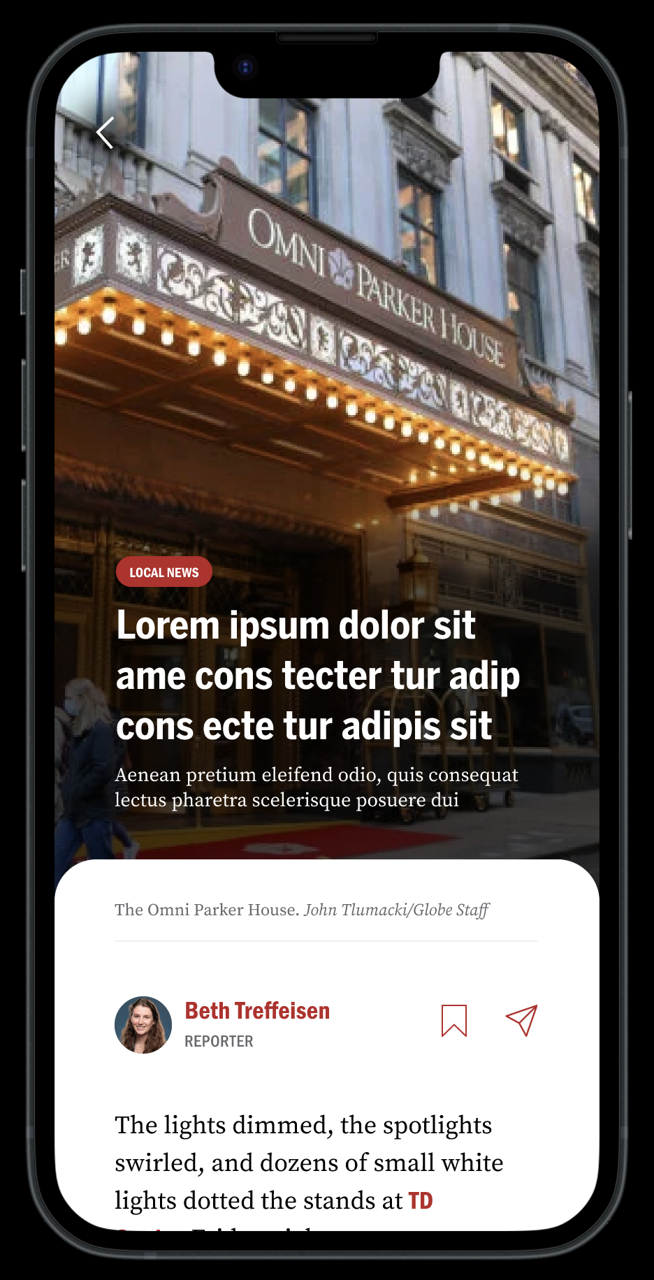
1. The article's hero became a deliberate editorial entry point
The decision: Articles now open with a full-bleed image that owns the entire screen. The category label appears as a red pill overlaid on the image. The headline is set at display scale directly over the photograph. A short deck — one to two sentences of context — sits below the headline, giving readers enough information to decide whether the story is worth their time before committing to the body copy. The image credit and author block appear on a floating white card below, creating a clean visual transition from the cinematic entry into the reading experience.
Why it matters: The original article template dropped readers immediately into a byline and body copy block. There was no designed moment of orientation — no visual signal of what the story was about or why it mattered. For a product asking readers to build a daily reading habit, that cold entry is a missed opportunity. The redesigned hero creates a brief moment of immersion that earns the reader's attention before the article begins.
The constraint it respected: User interviews flagged that loyal Boston.com readers are text-first — they explicitly did not want a picture-heavy experience. The hero addresses this by treating the full-bleed image as an entry moment, not a content format. Once the reader scrolls past the hero, the experience becomes text-dominant immediately. The image serves orientation, not decoration.
3. In-article imagery was given proper structural context
The decision: Images within the article body run full width with clear captions below. The caption treatment uses a smaller, lighter type style that is visually distinct from body copy — making it immediately clear what article content is and what the image context is.
Why it matters: In the original experience, in-article images interrupted reading flow without clear structural logic. Captions were visually similar to body copy, creating ambiguity about where the image ended and the article resumed. The redesigned treatment makes the image a deliberate structural moment — a pause in the reading experience that provides visual context before the narrative continues.
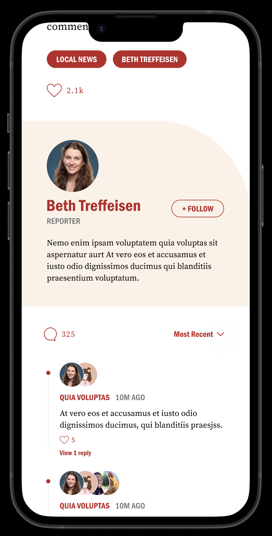
5. The author follow card introduced a new retention mechanism
The decision: At the end of every article, a dedicated author card surfaces — featuring the reporter's photo, name, title, a short bio, and a prominent Follow button. This was a new pattern, not an existing Boston.com feature.
Why I introduced it: User interviews revealed a consistent gap in the existing experience — readers had no way to build a relationship with the journalists whose work they valued. When a reader enjoyed a story, the experience offered no pathway to find more from that writer. The author follows the card addresses this directly by turning the end of an article — historically a dead end — into a relationship-building moment.
Why it matters for engagement: A reader who follows a reporter has given Boston.com a preference signal and created a personal reason to return. This is exactly the kind of habit-forming behavior that precedes subscription conversion. The card is positioned at the end of the article rather than at the top because it is earned — the reader has just finished the article and is most receptive to the reporter's identity at that moment, not before they've read a word.
Tradeoff: This feature requires editorial infrastructure — reporters need profile photos, bios, and a backend system to surface their content to followers. In a Pugpig environment, this would require scoping against platform capabilities before shipping. For this redesign exploration, it was proposed as a high-value feature that warrants the implementation investment, given its direct impact on return visit frequency.
2. Typography was redesigned for long-form mobile reading
The decision: The article body uses a serif typeface with generous line height, comfortable paragraph spacing, and a mobile-optimized reading size. Paragraphs are short. Inline hyperlinks are rendered in Boston.com red — an inherited pattern from the existing design system that was retained because it provides clear contextual navigation without disrupting reading flow.
Why it matters: The discoverability report identified cognitive fatigue as a barrier to article completion — long paragraphs, tight spacing, and visually similar text blocks made reading feel like work. The typographic redesign addresses this directly. Serif type at mobile reading size reduces eye fatigue in long-form contexts. Generous paragraph spacing creates natural breathing room, making long articles feel less daunting. The result is a reading experience that feels calm and considered rather than dense and utilitarian.
The research connection: User interviews found that readers valued Boston.com's brevity — they appreciated articles that respected their time. The typographic system reinforces that value signal even before a word is read. An article that looks readable feels readable. That perception matters for habit formation.
4. The article end was redesigned as a re-entry point, not a stopping point
The decision: Below the author follow card, the article end surfaces topic and author tags as tappable red pills, a like count, and the existing comments section — redesigned with cleaner visual hierarchy, stacked avatar indicators showing who has commented, and an always-visible comment input at the bottom of the screen.
Why it matters: The original article's end was a flat list of related links with no visual weight or editorial intention. Readers who reached the bottom had nowhere compelling to go. The redesigned end state gives readers three distinct options: explore more content by topic or author via the tag pills, engage with the story through likes or comments, or follow the reporter. Each option serves a different reader intent — discovery, engagement, or relationship — without forcing a single path.
The research connection: User interviews found that readers were frustrated by related content that felt irrelevant — clicking "more Celtics coverage" only to find old articles rather than contextually relevant stories. The tag-based navigation system gives readers direct control over what they explore next, rather than surfacing algorithmically adjacent content that may not match their intent.
Outcome
The redesigned article experience transforms Boston.com from a passive content delivery surface into an active reading environment. Every screen in the article flow serves a purpose: the hero earns attention, the typography sustains it, in-article imagery contextualizes it, the author card converts it into a relationship, and the article end redirects it into the next session moment.
The measure of success is session depth — specifically, whether readers who complete one article find a meaningful reason to open a second. The author follows card and topic tag navigation, which are the two highest-leverage features for moving that metric, because they give readers a personal reason to return rather than relying on the homepage alone to drive re-engagement.
7. Design Tradeoff
Every significant design decision in this project involved a tradeoff. Documenting them is not an exercise in covering weaknesses — it is an honest account of how design judgment works in a real product context. These are the four decisions where two reasonable options pulled in opposite directions and a choice had to be made.
1. Persistent navigation in the article view
The tension: Many long-form reading experiences remove navigation entirely during article consumption — The Atlantic, Longform, and certain NYT article views create a focused, distraction-free reading state by hiding the interface until the reader signals they want to leave.
The decision: I kept the bottom navigation visible throughout the article experience, but reduced it to four items and made the most important icons visually prominent using Boston.com red. The navigation is present but lightweight — supporting the experience without competing with it.
Why: Boston.com is not a single-article destination. User interviews confirmed that frequent readers move fluidly between articles, sections, and real-time updates within a single session. Removing navigation entirely would optimize for deep reading at the expense of session fluidity — the wrong tradeoff for a product where session depth, not article completion, is the primary engagement metric.
What I gave up: A fully immersive, distraction-free reading state. For readers who want to go deep on a single long-form piece, the persistent nav is a minor distraction. That cost was accepted because the majority of Boston.com's reading behavior is browse-first rather than read-first.
How I'd validate this: A/B test nav-present versus nav-hidden in the article view. Measure articles per session and session duration as the primary indicators. If nav-hidden produces longer individual article reads without reducing session depth, the tradeoff should be reconsidered.
2. Reduced content density on the homepage
The tension: The existing Boston.com homepage surfaced approximately 40 stories within the first screen of content on mobile. That density is not accidental — in an ad-supported model, more visible content means more impression opportunities. It also reflects what loyal readers told us directly: they value the breadth and density of the homepage and use it as their primary navigation tool.
The decision: The redesign reduced visible story count above the fold in favor of stronger visual hierarchy, larger card treatments, and clearer section structure. Fewer stories are immediately visible, but each one is more legible and easier to evaluate quickly.
Why: The research showed that readers scan the homepage in 10–30 seconds and process approximately 20–28% of what's on screen. At 40 elements, most content was invisible in practice — present on the page but not registered by the reader. Reducing density does not reduce content availability. It reduces competition, which increases the likelihood that any individual story gets noticed.
What I gave up: Raw impression volume and the familiar density that loyal readers associate with Boston.com's identity. This tradeoff requires editorial buy-in — some stakeholders will read reduced density as reduced value. The case for it has to be made in engagement metrics, not visual preference.
How I'd validate this: Compare click-through rate per story, scroll depth, and return visit frequency between the current and redesigned homepage. The hypothesis is that higher click-through per story offsets lower raw story count — and that return visit frequency increases as readers find the experience less overwhelming.
3. Horizontal scroll modules as a carousel alternative
The tension: The research identified content discovery as one of the three systemic failures in the existing experience. My hypothesis was that carousel-based content modules — allowing readers to browse multiple stories within a compact horizontal footprint — would meaningfully improve discovery and increase articles viewed per session. Carousels are a proven pattern for this use case across comparable products including The Athletic, Apple News, and Google Discover.
The decision: Pugpig's architecture made full interactive carousel modules unfeasible without significant custom development outside the scope of this project. Rather than abandoning the goal, I introduced horizontally scrollable image grids within named sections — Most Popular, Things To Do, You Might Also Like — achieving the same core behavior within the platform's existing capabilities.
Why: The scrollable grid solves the same problem the carousel would have solved: more content browsable within a smaller vertical footprint, without extending page length. The interaction model is slightly less fluid than a true carousel, but the discovery benefit is preserved.
What I gave up: The full carousel experience — momentum scrolling, snap points, and the editorial control that comes with a purpose-built component. The horizontal grid is a platform-constrained approximation, not the optimal solution. In a future engagement with custom development resources, the carousel pattern would be the right direction to pursue.
How I'd validate this: Measure content interaction rate within horizontal scroll sections versus equivalent vertical list sections. If readers engage with horizontal modules at a higher rate, it validates the pattern and builds the case for investing in a proper carousel component.
4. Proposing that the author follow the card beyond current platform capabilities
The tension: The author follow card — surfaced at the end of every article, allowing readers to follow a specific reporter and receive their future coverage — was identified as one of the highest-leverage features for building return visit habits. It turns a passive reading moment into a signal of a relationship. It gives readers a personal reason to come back that is independent of the homepage.
The decision: I designed and proposed the author follow card knowing it would require editorial infrastructure — reporter profiles, bios, photos — and backend capability to surface personalized content to followers. Within Pugpig's current architecture, this would require scoping and likely custom development before it could ship.
Why: The engagement value of this feature justified proposing it beyond the current platform's out-of-the-box capabilities. User interviews showed that readers lacked a mechanism to build relationships with the journalists whose work they valued. When they enjoyed a story, the experience offered no pathway to find more from that writer. That gap directly suppresses return visit frequency — one of the four primary metrics this redesign was built to move.
What I gave up: Staying entirely within Pugpig's existing feature set. This was the one place in the redesign where I deliberately proposed something that would require a platform conversation before it could be realized. I made that choice because designing only within current constraints means designing only for the product as it exists today — not for where it needs to go.
How I'd validate this: Instrument the follow rate per article and measure whether readers who follow at least one reporter show higher return-visit frequency and longer session depth than those who don't. If the correlation is strong, it validates the infrastructure investment.
8. Reflection
What I would do differently:
The biggest process change I would make is starting with the article experience rather than the homepage.
I defaulted to the homepage first because it is the most visible surface and the most straightforward to frame visually. But for a product where engagement depth is the primary metric, the article experience is where the actual value is delivered. It is also the harder design problem — it requires type-system decisions, engagement architecture, and content-structure rules that thet require. Starting with’. Starting with the article would have given me a more rigorous foundation to build the homepage system from, rather than the other way around.
I also would have defined my target reader more explicitly before designing a single screen.
Boston.com has at least two distinct user modes. The first is the habitual local news checker — high frequency, short sessions, scanning for what matters today. The second is the long-form reader — lower frequency, longer sessions, going deep on sports coverage or feature stories. These two modes need different hierarchy models, different content treatments, and potentially different entry points into the experience.
I designed primarily for the habitual scanner — the reader the research knew most about, and the reader whose behavior the homepage data reflected most clearly. The 6% of Boston.com users who drive 60% of pageviews are overwhelmingly in this category. Designing for them was a deliberate choice: they are the readers most likely to convert to a subscription, the ones who already see value in the product and return to it daily.
But that decision has a cost. The other 94% — infrequent visitors and new readers who haven't yet built a habit — need stronger discovery signals, clearer onboarding into what Boston.com covers, and more immediate demonstrations of value. The redesign serves them less directly. A real product engagement would require explicitly defining both user modes at the outset, testing which one correlates more strongly with subscription conversion, and designing hierarchy systems that serve both without compromising either.
What surprised me
I went into this project assuming navigation was one of the primary problems. The research confirmed it — but not in the way I expected. The discoverability report gave Boston.com a findability score of 2/5, and user interviews showed that readers rarely used the navigation bar, relying almost entirely on the homepage to navigate the product.
That finding reframed the navigation problem entirely. The issue was not that navigation was hard to use — it was that readers had stopped trusting it as a useful tool and had instead built workarounds. Fixing the navigation components without fixing the homepage hierarchy that had replaced them would have been the wrong solution. That insight is what pushed the homepage section structure — named sections with clear visual separation — to the center of the redesign rather than treating it as a secondary concern.
What I would build next
If this redesign shipped tomorrow, the next surface I would go design is the paywall gate itself.
The paywall is the most critical moment in a subscription product and the one most commonly treated as a conversion problem rather than a design problem. Most paywall experiences are architecturally identical: a blurred article, a modal requesting payment, and a list of plan options. They ask readers to pay before demonstrating what they are paying for.
I believe there is a significant opportunity to redesign the paywall moment as a value demonstration — showing the reader exactly what they are gaining access to, surfacing the depth of Boston.com's coverage in the moment of the ask, and making the subscription feel like an unlock rather than a gate. That reframe — from barrier to invitation — is a design problem, not a pricing or marketing problem. And it is the natural next chapter of everything this redesign was building toward.