Designing a Personalized News Experience for The Boston Globe
1. One to One For Everyone
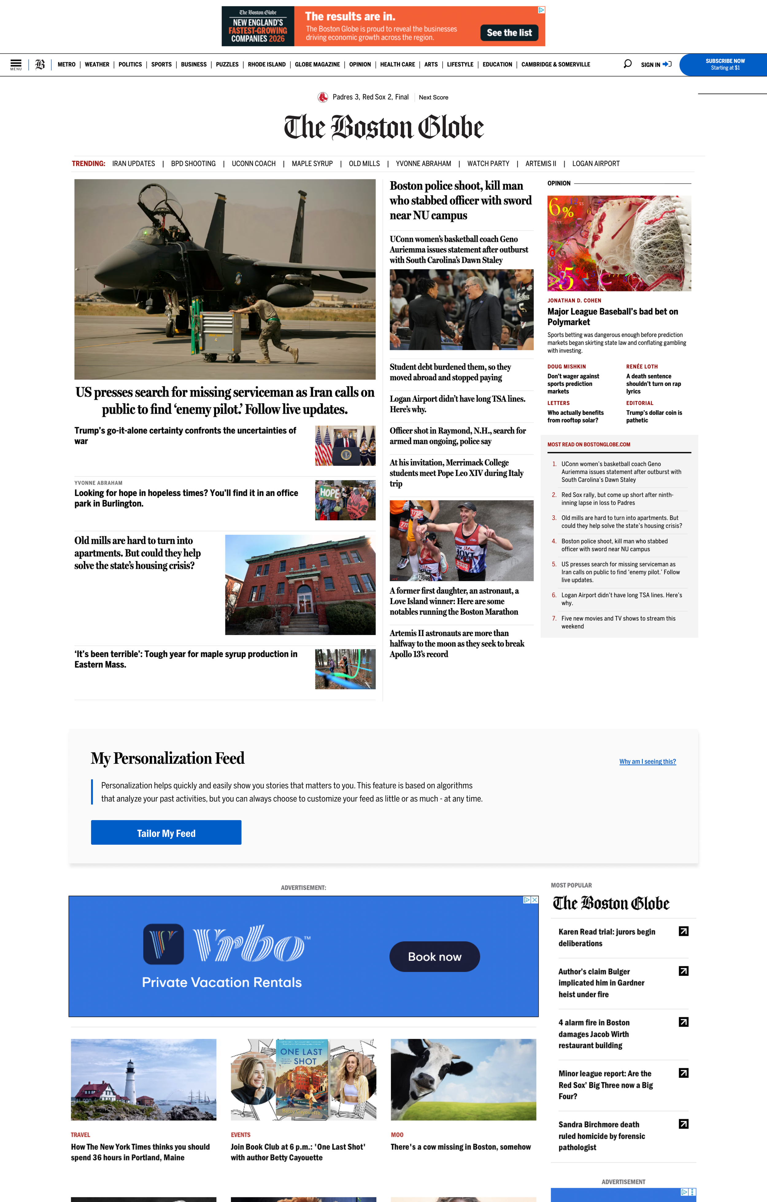
Boston Globe Media had a subscription growth problem that wasn't about content volume; it had plenty. The problem was that returning subscribers, the users most likely to convert and retain, were served the same undifferentiated homepage as a first-time visitor. Every visit started over.
I first raised this at a company hackathon after noticing how far behind the industry we were: readers already expected tailored experiences from The New York Times and The Washington Post, and from consumer platforms like Netflix and Spotify, which had reset expectations for content discovery entirely. The hackathon idea sparked enough internal interest that I followed up with formal research, including user interviews, usability sessions, and a review of industry and internal engagement patterns, to turn it into a real proposal.
One finding stuck with stakeholders more than any other: most frequent homepage visitors didn't realize the homepage changed throughout the day. Once they understood it did, several described the same frustration, finding an article in the morning, then being unable to find it again later because the layout had already moved on. That single insight reframed the problem for leadership: this wasn't just about adding personalization; it was about reader trust in a homepage that felt unstable and impossible to return to.
I brought that research - industry trends, internal homepage behavior, and that usability finding to Product, Engineering, Design, and VP-level stakeholders across The Boston Globe, Boston.com, and Boston Magazine, with a recommendation to build a personalization framework that lets readers shape their homepage without losing the editorially-curated top stories.
The team built and tested a broader personalization system in Arc's sandbox environment, where it validated the concept with real user feedback. That full system wasn't released to production as priorities shifted before it could ship. What was shipped was a narrower, algorithmically driven "For You" widget, which introduced personalized recommendations while keeping editorial placement and implementation complexity manageable. The Globe Hub module and the more user-controlled version of personalization were both cut from that release.
The "For You" widget shipped and demonstrated positive engagement with subscribers. This case study explores both the component that launched and the broader personalization ecosystem that was designed but not fully implemented, including what shipped, what didn't, and why.
Role: Sole Designer
Duration:
5 weeks
Tools:
White Board, Maze, Figma, Zoom, Amplitude
2. Understanding the Trade-offs of Personalization
3. Research
Before defining a personalization strategy, I stepped back to ask a critical question:
What should personalization mean in a news experience, and what are we optimizing for?
While personalization can make content more relevant, in journalism it introduces meaningful trade-offs between engagement and editorial responsibility.
1. The Opportunity
At its best, personalization transforms news from a generic feed into a more intentional experience that adapts content based on a reader's interests, behavior, and context.
This creates clear value:
Easier discovery of relevant stories
Reduced cognitive overload
Opportunities to introduce adjacent topics and deepen engagement
It also increases user agency, allowing readers to feel more in control of what they consume.
2. The Tension
However, personalization in news is not purely a product problem; it's an editorial one. Left unchecked, personalization risks creating filter bubbles that reinforce existing beliefs while limiting exposure to diverse perspectives. This raises a fundamental question:
Are we optimizing for what users want, or what they need to know?
Editorial teams prioritize stories based on public importance, while algorithms tend to optimize for engagement signals like clicks or time spent. These goals don't always align.
Over-personalization can also remove serendipity - the unexpected discovery of stories outside a user's usual interests, which is essential to a healthy news experience.
I tested this tension directly with users rather than resolving it by argument alone: given a choice between an all-stories homepage and one that let them prioritize topics themselves, readers chose control. That result, not just the philosophical tension, is what shaped the design of the "For You" widget that ultimately shipped.
I ran a mixed-methods research effort consisting of 12 user interviews, moderated usability testing of live prototypes, an Applause diary study with 16 Gen Z and Millennial readers across mobile and desktop, and widget-level analytics, in partnership with two researchers on the team.
Several patterns stood out:
Readers default to social-media-triggered reading, even when they have dedicated news habits.
Even participants who read at fixed times of day were still pulled into news first by social feeds and notifications. That meant the homepage wasn't just competing with other news sites; it was competing with feeds that already felt more personalized and lower-effort.
Direct news readers follow a consistent pattern: scan the front page for an overview, then drill into sections of interest.
That behavior shaped the homepage hierarchy I designed: For You → Top Stories → Categories, rather than that order being a design assumption.
Relevance wasn't just topical — it was personal.
The stories that made people stop and engage weren't necessarily the most-clicked; they were the ones tied to their actual lives, a former workplace, their kid's school, their own profession. That distinction shaped how I thought about the "For You" ranking logic: matching topics alone wasn't enough.
Local news was a mixed signal, and it became a real design tradeoff.
Most participants didn't actively seek out local news; it wasn't a daily driver for them. But the subset who did check it were checking things tied directly to their lives: school closures, weather, local business, and political news that affected people they knew.
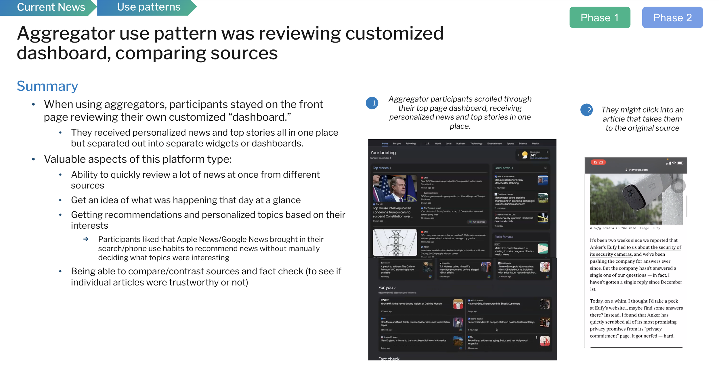
Users compared the Globe unfavorably to both premium competitors and aggregators.
Against The New York Times, the homepage felt "provincial" and underpriced for its premium feel. Against aggregators like Apple News and Google News, it lacked the glanceable, personalized dashboard readers had come to expect; one participant described checking Apple News once or twice a day specifically because it surfaced what interested them without manual work.
To resolve the editorial-vs-personalization tension directly rather than just argue it philosophically, I tested it with users: given a choice between an all-stories homepage and one where they could prioritize topics themselves, users chose control. That result is what justified building the "For You" widget around user-influenced ranking rather than a purely editorial or purely algorithmic feed.
Key Insight:
Users don’t want to browse the news—they want to quickly get the information that matters to them.


4. Problem Statement & My Role


( Want to explore the full research? I'd be happy to share more.)
Problem Statement
Subscribers – readers who were logged in, identifiable, and already paying for the product were served the exact same homepage as an anonymous, first-time visitor. Despite having the most to gain from a tailored experience and the most identifiable signal for building one, subscribers got no benefit from that status anywhere on the homepage. Research reinforced that this gap mattered: subscribers struggled to see clear value in paying when free alternatives and personalized competitors offered a more relevant experience for less.
My Role: Lead Product Designer
I took a hackathon idea into a funded, cross-functional initiative where I owned research, strategy, and design across the project. I coordinated with two other researchers on the mixed-method research effort and presented findings and recommendations to Product, Engineering, Design, and VP-level stakeholders across The Boston Globe, Boston.com, and Boston Magazine.
Beyond design execution, I made the core tradeoff calls that shaped what shipped: deciding where personalization could and couldn't override editorial judgment, and where to invest in a feature (Globe Hub) the research didn't clearly demand but the mission justified.

5. Solution
A. Introducing a Personalized "For You" Experience
Problem:
Subscribers expected personalized content and wanted more control over what they see — but research also showed they still relied on the Globe to surface the most important stories of the day, regardless of individual preference.
The tradeoff:
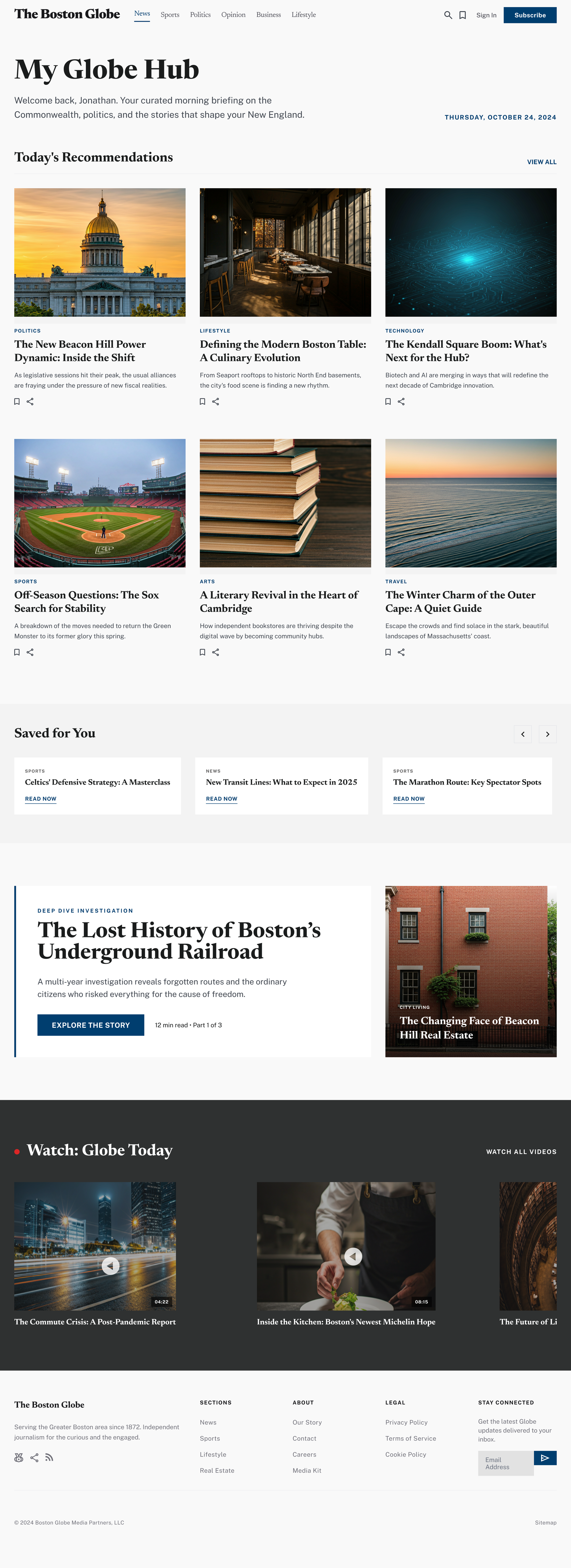
This is where the editorial-integrity tension from Section 1 had to be resolved concretely, not just philosophically. As a news organization, the Globe has a responsibility to surface its most important stories regardless of any individual reader's preferences. Therefore, editor-curated content had to remain the primary entry point and couldn't be personalized away. At the same time, research showed readers wanted more control over discovery beyond that. The resolution was placement: the "For You" widget was deliberately positioned below the fold, after the primary editorial modules, rather than at the top. Leading with personalized recommendations risked fragmenting the experience and reducing exposure to the stories the newsroom judged most significant. Placing it lower lets both things be true: readers saw the newsroom's top stories first, then a personalized layer underneath.
Design decisions:
Editor-curated Top Stories remained the primary, non-personalizable homepage entry point
"For You" was introduced as a distinct, clearly separated module below the fold
Combined behavioral recommendations with user-selected topic preferences within that module
Impact:
This structure lets the team ship personalization without overriding editorial judgment, the part of the broader vision that needed to be true for editorial leadership to support it at all. Hence, editorial leadership approved the rollout on the condition that Top Stories remained non-personalizable.
C. Designing for Discoverability Beyond the Homepage
Problem:
Personalization needed to be accessible and valuable to readers, but the homepage's above-the-fold layout wasn't something I could modify. If "For You" lived only in its one homepage placement, its value depended entirely on whether a reader happened to scroll to that exact module.
The constraint-driven decision:
Rather than treating that single homepage placement as the only path to personalization, I added a "For You" entry point in primary navigation and the hamburger menu that took readers directly to the For You section on the homepage. Therefore, a reader entering from any point on the site could jump straight to their personalized content, rather than stumbling into it by scrolling.
Design decisions:
Added "For You" as a navigation item in the primary nav and hamburger menu
Linked that navigation entry directly to the For You module's position on the homepage
Ensured personalization was reachable from anywhere in the site, not dependent on a reader's scroll behavior on the homepage
Impact:
This meant For You's value wasn't capped by its single homepage placement; readers could reach their personalized content directly and consistently, regardless of how they entered the site.
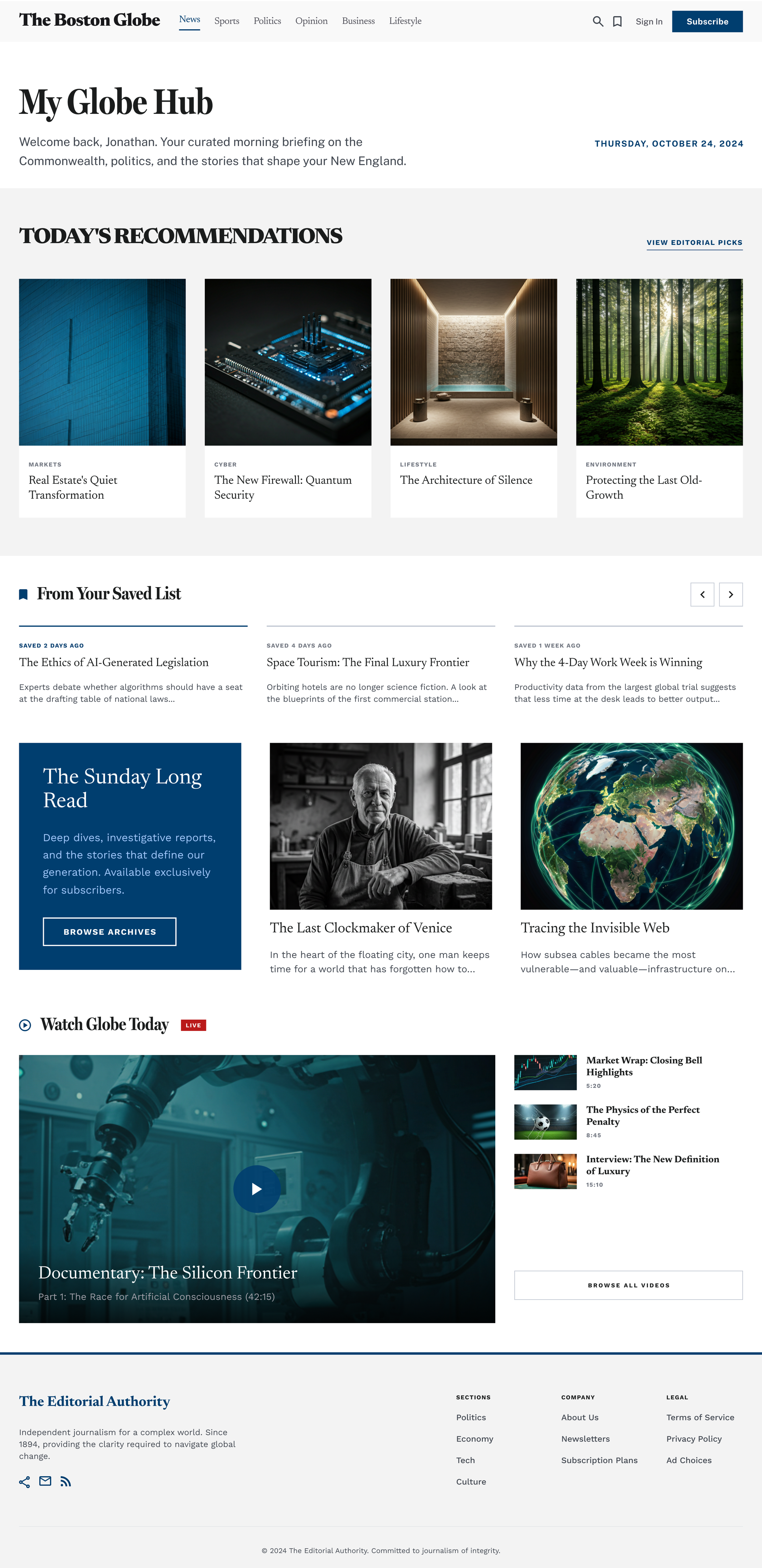
B. Designing for Daily Utility (Globe Hub)
Problem:
Subscribers engage with news to accomplish tasks, not just to browse but research on local content specifically was mixed. Most participants didn't actively seek out local news as a daily driver. The subset who did, however, were checking things directly tied to their lives: school closures, weather, local business and political news affecting people they knew.
The tradeoff:
I didn't have majority-demand data to justify Globe Hub the way I did for the "For You" widget. Instead, this was a strategic hypothesis: as a regional news organization, the Globe has a mission to serve hyperlocal relevance that general-interest aggregators like Apple News or Google News structurally can't. That's a differentiation point competitors can't easily copy. The bet was that low overall demand didn't mean low value for the readers it did serve, and that this gap was worth testing rather than dismissing because it didn't show up in top-line research numbers.
Design decisions:
Introduced Globe Hub as a dedicated module for geographically relevant content, events, and information, separated from general content discovery rather than competing with it for the same homepage real estate
Treated it as a hypothesis to validate through testing and usage data, not a confirmed need
Impact:
Globe Hub was tested in Arc's sandbox but not included in the production rollout when priorities shifted. So this remains a validated concept rather than a measured outcome. If I revisited it, the first thing I'd test is whether engagement from the local-news subset translates into measurably higher retention than the broader population, which would justify the homepage real estate it requires.
Impact
Business Impact
The "For You" widget, the only piece of the personalization vision that ultimately shipped, performed strongly once live. 80% of users who encountered the widget clicked into at least one recommended article, and on average, readers viewed roughly 3 of the 5 articles presented within the module. Beyond initial clicks, usage patterns showed readers returning to the widget after finishing an article to continue exploring recommendations, while others used it as a jumping-off point into broader topic sections they hadn't been navigating to directly before. That return behavior, not just the initial click, was the strongest signal that personalization was working as intended: readers were treating it as a discovery tool, not a one-time novelty.
Product Impact
Gave readers a personalized entry point without overriding editorial judgment: Top Stories remained the primary, non-personalizable placement, resolving the editorial tension from Section 1 directly rather than by assertion
Made personalization reachable from anywhere in the site through dedicated navigation entry points, not dependent on a single homepage placement
Validated, through direct testing, that readers preferred having control over content discovery (the all-stories vs. prioritize-topics test), giving the team evidence to act on rather than relying on assumption
Team & Strategic Impact
Took personalization from a hackathon idea to a cross-functional initiative with buy-in from Product, Engineering, Editorial, and leadership across three brands
Established a working model for resolving editorial-vs-algorithmic tension that could inform future personalization work, including Globe Hub if revisited
Measuring Success (Next Step)
The "For You" widget was the only part of the personalization vision that shipped. Globe Hub and the broader, more user-controlled version of personalization were tested in Arc's sandbox and validated conceptually, but didn't make it into production both because priorities shifted elsewhere and because the system's technical capacity at the time couldn't fully support it.
The widget's performance, return visits to the module, exploration into sections readers hadn't navigated to directly before, shows personalization is working at the aggregate level. But I'd still want to refine the signal feeding the underlying recommendation logic. Right now it likely relies on raw clicks, which don't always reflect genuine interest. A reader might click out of curiosity or by accident, and that click still shapes future recommendations. I'd like to test whether weighting clicks by actual time spent on the article afterward produces even more precise recommendations than click data alone, even on top of results that are already positive.
Longer term, this work also surfaced a structural question about the homepage itself. The current page was built around a single, generalized hierarchy but layering "For You" on top of it means the homepage is now serving multiple distinct content models (editorial, personalized) within a layout that wasn't originally designed to support more than one. Given more time, I'd recommend a broader homepage redesign that treats personalization as a first-class layout consideration from the outset, rather than something added on top of an existing structure.
Reflection
Two moments on this project changed how I think about using data to make design decisions, and they pulled in opposite directions.
The first was deciding to build Globe Hub despite research indicating it wasn't a driver of majority demand. My instinct going in was that low engagement numbers meant low priority because that's usually the safe, data-backed call. But the Globe's mission as a regional news organization meant some decisions had to be evaluated on more than aggregate demand. The readers who did want hyperlocal content were checking things tied directly to their lives, such as school closures, local politics, their own neighborhoods, and that mattered even though they were a minority. I learned to treat low demand as a question worth testing, not an automatic no.
The second moment pulled the opposite way: realizing that a signal which looked strong – clicks on the "For You" widget- couldn't be fully trusted either. A click doesn't always mean genuine interest; someone might click out of curiosity or by accident, and that click still shapes what gets recommended to them next. So the lesson wasn't "trust the data" or "ignore the data," but about learning to ask what a given signal actually proves and being willing to act differently depending on the answer, even within the same project.
That's the bigger shift this work caused for me: moving from treating data as something that gives you a clear answer to treating it as something you have to interrogate before you decide how much weight it deserves.